Wpf.NotificationCenter
1.1.4
There is a newer version of this package available.
See the version list below for details.
See the version list below for details.
dotnet add package Wpf.NotificationCenter --version 1.1.4
NuGet\Install-Package Wpf.NotificationCenter -Version 1.1.4
This command is intended to be used within the Package Manager Console in Visual Studio, as it uses the NuGet module's version of Install-Package.
<PackageReference Include="Wpf.NotificationCenter" Version="1.1.4" />
For projects that support PackageReference, copy this XML node into the project file to reference the package.
paket add Wpf.NotificationCenter --version 1.1.4
The NuGet Team does not provide support for this client. Please contact its maintainers for support.
#r "nuget: Wpf.NotificationCenter, 1.1.4"
#r directive can be used in F# Interactive and Polyglot Notebooks. Copy this into the interactive tool or source code of the script to reference the package.
// Install Wpf.NotificationCenter as a Cake Addin
#addin nuget:?package=Wpf.NotificationCenter&version=1.1.4

// Install Wpf.NotificationCenter as a Cake Tool
#tool nuget:?package=Wpf.NotificationCenter&version=1.1.4
The NuGet Team does not provide support for this client. Please contact its maintainers for support.
Wpf.NotificationCenter
Objective
- Create Toast Notifications
- Create Alerts for the notification Center
- Read previous alerts / toasts in one place.
- Unread indicator
- Customizable
Contents
Installation
Install NuGet Package (Wpf.NotificationCenter)
Choose one:
- .NET CLI
dotnet add package Wpf.NotificationCenter --version 1.0.0
- Package Manager
NuGet\Install-Package Wpf.NotificationCenter -Version 1.0.0
- Package Reference
<PackageReference Include="Wpf.NotificationCenter" Version="1.*" />
- Paket CLI
paket add Wpf.NotificationCenter --version 1.0.0
- Script & Interactive
#r "nuget: Wpf.NotificationCenter, 1.0.0"
- Cake
- Install Wpf.NotificationCenter as a Cake Addin
#addin nuget:?package=Wpf.NotificationCenter&version=1.0.0
- Install Wpf.NotificationCenter as a Cake Tool
#tool nuget:?package=Wpf.NotificationCenter&version=1.0.0
- Install Wpf.NotificationCenter as a Cake Addin
App.xaml (Add Theme)
Include theme resource dictionary
<ResourceDictionary Source="pack://application:,,,/Wpf.NotificationCenter;component/Themes/Generic.xaml" />
App.xaml.cs (update the services collection)
Add using statement
using Wpf.NotificationCenter.Extensions;Add the services to the collection:
services.UseWpfNotificationCenter();
MainWindow.xaml (Add Notification Center)
Add namespace
xmlns:notificationCenter="clr-namespace:Wpf.NotificationCenter;assembly=Wpf.NotificationCenter"Add Notification Center with content inside.
<notificationCenter:NotificationCenter
      x:Name="NotificationCenter"
      VerticalAlignment="Stretch"
      HorizontalAlignment="Stretch"
      NewAlertColor="GoldenRod"
      NoAlertColor="Gray"
      AlertMaxWidth="175"
      MaxNotifications="10"
      BorderBrush="Blue"
      IsItemsAscending="False">
      <notificationCenter:NotificationCenter.Header>

          <c:MainNavMenu Grid.Row="0" Navigate="{Binding DataContext.NavigateCommand, RelativeSource={RelativeSource AncestorType={x:Type c:MainWindow}}}"
                                      ViewContext="{Binding DataContext.ViewContext, RelativeSource={RelativeSource AncestorType={x:Type c:MainWindow}}}" />
      </notificationCenter:NotificationCenter.Header>
      <notificationCenter:NotificationCenter.Content>
          <Grid>

          </Grid>
      </notificationCenter:NotificationCenter.Content>
</notificationCenter:NotificationCenter> ```
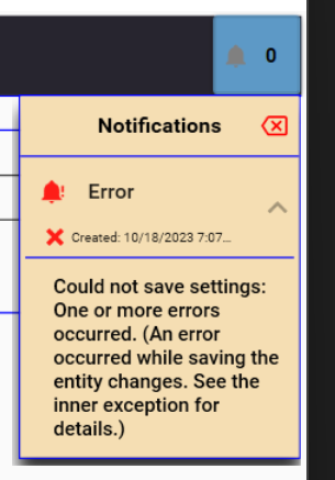
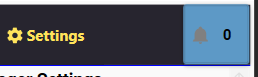
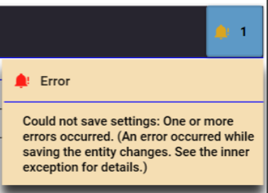
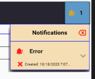
Example Images
| Notification Center resides in the header. | Toast notifications can be shown. |
 |
 |
| Alert center Notification with collapsed message. | Alert center Notification with expanded message. |
 |
|
Customization
Notification Center Element Properties
| Property | Value Type | Default | Description |
|---|---|---|---|
| AlertMaxHeight | Double | 150 | The alert text content maximum height in the alert center. |
| AlertMaxWidth | Double | Auto | The alert maximum width property of the notification center popup. |
| ButtonHorizontalAlignment | HorizontalAlignment | Right | Indicates the placement of the Alert Center. |
| ButtonVerticalAlignment | VerticalAlignment | Top | Indicates the placement of the Alert Center. |
| ButtonZIndex | Integer | 999 | Indicates the order in which the button is drawn over content. |
| BorderBrush (Inherited) | Brushes | Transparent | Used for line colors in notification center and / or headers. |
| IsItemsAscending | Boolean | False | Indicates the order of alerts in the notification center. |
| MaxNotifications | Byte | 0 (Unlimited) | The upper limit of notifications allowed in the alert center. Oldest are removed when this number is exceeded. |
| NewAlertColor | Brushes | Goldenrod | Color of the icon when there is a new alert. |
| NewAlertIcon | PackIconKind | BellAlert | The icon when there is a new alert. |
| NoAlertColor | Brushes | Black | Color of the icon when there are no unread alerts. |
| NoAlertIcon | PackIconKind | Notifications | The icon when there are no unread alerts. |
| PopupHorizontalPlacement | Double | 0 | Alert Center Popup Positioning. |
| PopupPlacement | PlacementMode | Bottom | Alert Center Popup Positioning. |
| PopupStaysOpen | Boolean | False | Indicates if the popup should stay open or automatically close when clicking away. |
| PopupVerticalPlacement | Double | 0 | Alert Center Popup Positioning. |
| ShowButtonInHeader | Boolean | True | Sets whether the notification center button is visibile. Set to 'False' to hide the button. |
| ShowButtonInContent | Boolean | False | Sets whether the notification center button is visibile. Set to 'False' to hide the button. |
Example
See usage in main window section.
Detailed Customization Theme File
Most of the look / feel is defined in the generic.xaml file. Primary theme styles are inherited from the theme of the site.
Click here to view the theme - generic.xaml
API Documentation
Release Notes
- Initial Release - v1.0.0.
- Add UI fixes, more customization, fix bugs - v1.1.0.
- Add Notification Options, Customization Options - v1.1.1.
| Product | Versions Compatible and additional computed target framework versions. |
|---|---|
| .NET | net6.0-windows7.0 is compatible. net7.0-windows was computed. net7.0-windows7.0 is compatible. net8.0-windows was computed. |
Compatible target framework(s)
Included target framework(s) (in package)
Learn more about Target Frameworks and .NET Standard.
-
net6.0-windows7.0
- CommunityToolkit.Mvvm (>= 8.2.1)
- MaterialDesignExtensions (>= 3.3.0)
- MaterialDesignThemes (>= 4.3.0)
- Microsoft.Extensions.DependencyInjection.Abstractions (>= 7.0.0)
-
net7.0-windows7.0
- CommunityToolkit.Mvvm (>= 8.2.1)
- MaterialDesignExtensions (>= 3.3.0)
- MaterialDesignThemes (>= 4.3.0)
- Microsoft.Extensions.DependencyInjection.Abstractions (>= 7.0.0)
NuGet packages
This package is not used by any NuGet packages.
GitHub repositories
This package is not used by any popular GitHub repositories.