BlazingStory.ProjectTemplates
1.0.0-preview.31
See the version list below for details.
dotnet new install BlazingStory.ProjectTemplates::1.0.0-preview.31
 Blazing Story


📝 Summary
The clone of "Storybook" for Blazor, a frontend workshop for building UI components and pages in isolation.
The "Blazing Story" is built on almost 100% Blazor native (except only a few JavaScript helper codes), so you don't have to care about npm, package.json, webpack, and any JavaScript/TypeScript code. You can create a UI catalog application on the Blazor way!
You can try it out from the live demonstration site at the following link: https://jsakamoto.github.io/BlazingStory/
🚀 Getting Started
Example scenario
For the example scenario, you already have a Blazor WebAssembly application project, "MyBlazorWasmApp1", that includes the "Button" component.
📂 (working directory)
    + 📄 MyBlazorWasmApp1.sln
    + 📂 MyBlazorWasmApp1
        + 📄 MyBlazorWasmApp1.csproj
        + ...
        + 📂 Components
            + 📄 Button.razor
            + ...
Preparation
Close all Visual Studio IDE instances (if you use Visual Studio IDE), and install the "Blazing Story" project template with the following command. (This installation instruction is enough to execute once in your development environment.)
dotnet new install BlazingStory.ProjectTemplates
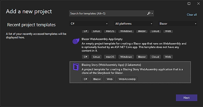
Creating a Blazing Story app and stories
Step 1 - Create a new Blazing Story app project
Open the solution file (.sln) with Visual Studio, and add a new "Blazing Story" project from the project templates. (In this example scenario, we named it "MyBlazorWasmApp1.Stories")
If you are working on dotnet CLI, you can do that with the following commands in a terminal.
Note
Please remind again that this example scenario assumes that there is already a solution file (.sln) in the current directory with an existing Blazor WebAssembly app project.
# Create a new Blazing Story app
dotnet new blazingstorywasm -n MyBlazorWasmApp1.Stories
# Add the Blazing Story app project to the solution
dotnet sln add ./MyBlazorWasmApp1.Stories/
The file layout will be the following tree.
📂 (working directory)
    + 📄 MyBlazorWasmApp1.sln
    + 📂 MyBlazorWasmApp1
        + ...
    + 📂 MyBlazorWasmApp1.Stories
        + 📄 MyBlazorWasmApp1.Stories.csproj✨ 👈 Add this
Step 2 - Add a project reference of the Blazor Wasm app to the Blazing Story project
Next, add a project reference in the Blazing Story App project "MyBlazorWasmApp1.Stories" that refers to the Blazor WebAssembly app project "MyBlazorWasmApp1".
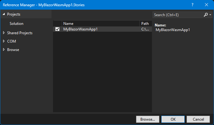
If you are working on dotnet CLI, you can do that with the following commands in a terminal.
dotnet add ./MyBlazorWasmApp1.Stories reference ./MyBlazorWasmApp1
📂 (working directory)
    + 📄 MyBlazorWasmApp1.sln
    + 📂 MyBlazorWasmApp1 <--- refers --+
        + ...                           |
    + 📂 MyBlazorWasmApp1.Stories ------+
        + ...
Step 3 - Add a "stories" file
Add a new "stories" file to the Blazing Story App project "MyBlazorWasmApp1.Stories".
A "stories" file is a normal Razor Component file (.razor), but it is annotated with the [Stories] attribute and includes a markup of the <Stories> component. There is no restriction on file layout of "stories" files, but usually, we place it in the "Stories" subfolder.
Warning
Currently, The file name of the "stories" files must end with ".stories.razor". This is a requirement of the naming convention for available the "Show code" feature in the "Docs" pages.
In this example scenario, we are going to write a "stories" for the Button component lived in the "MyBlazorWasmApp1" project, so we would add a new story file named "Button.stories.razor" in the "Stories" subfolder where is under the "MyBlazorWasmApp1.Stories" project.
📂 (working directory)
    + 📄 MyBlazorWasmApp1.sln
    + 📂 MyBlazorWasmApp1
        + ...
    + 📂 MyBlazorWasmApp1.Stories
        + 📄 MyBlazorWasmApp1.Stories.csproj
        + 📂 Stories
            + 📄 Button.stories.razor✨ 👈 Add this
Step 4 - Implement the "stories"
Implement a stories.
The "Button.stories.razor" would be like the below.
@using MyBlazorWasmApp1.Components
@attribute [Stories("Components/Button")]

<Stories TComponent="Button">

    <Story Name="Primary">
        <Template>
            <Button Label="Button" Primary="true" @attributes="context.Args" />
        </Template>
    </Story>

</Stories>
Step 5 - Run it!
If you are working on Visual Studio, right-click the "MyBlazorWasmApp1.Stories" project in the solution explorer to show the context menu, click the "Set as Startup Project" menu item, and hit the Ctrl + F5 key.
If you are working on dotnet CLI, you can do that with the following commands in a terminal.
dotnet run --project ./MyBlazorWasmApp1.Stories
Then you will see the clone of the "Storybook" built on Blazor! 🎉

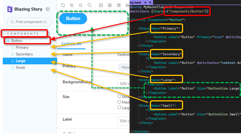
📂 Structure of "stories"
- The
[Stories]attribute on a Razor component indicates to the Blazing Story runtime that the Razor component will include stories. - The slash-separated title string of the parameter of the
[Stories]attribute configures the navigation tree and represents the title of the stories container (we called it "Component"). - The
<Stories>component indicates to the Blazing Story runtime what is the target component of the story with itsTComponenttype parameter. The "Controls" panel will be built from this component-type information. - The
<Stories>component can include one or more<Story>components. The<Story>component has theNameparameter, which will be shown in the sidebar navigation tree to identify each story. - The
<Template>render fragment parameter inside the<Story>component will be rendered in the canvas area when that story is selected in the sidebar navigation tree. - The Blazing Story runtime passes the parameters users inputted from the "Control" panel through the
context.Argsinside the<Template>render fragment, so you should apply it to the component by using the@attributes=..., attribute splatting syntax.
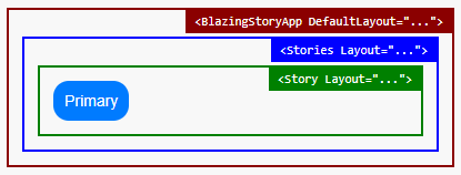
⚙️ Configure layouts
If you want to apply the same layout for every story, you can specify the layout component to use when displaying a story. This architecture is mostly the same as Blazor's standard layout mechanism (see also: "ASP.NET Core Blazor layouts | Microsoft Learn"). A layout component must inherit from the LayoutComponentBase class and should have the rendering @Body in its markup. If you apply the layout component like the one below to stories,
@inherits LayoutComponentBase
<YourThemeProvider>
    <div style="padding: 24px;">
        @Body
    </div>
</YourThemeProvider>
The story which applied the layout component above will be rendered as a child component of the <YourThemeProvider> component (imagine you implemented that component such a component including some cascading values) and will have 24-pixel padding.
Application level layout
The specified layout component for stories is in multiple levels.
First, you can specify the layout for the application level via the DefaultLayout property of the BlazingStoryApp component, which is usually marked up in your App.razor file.
@* 📄App.razor *@
<BlazingStoryApp ... DefaultLayout="typeof(DefaultLayout)">
</BlazingStoryApp>
In the above case, the layout component DefaultLayout.razor will be used when displaying every story.
Component (Stories) level layout
Second, you can specify the layout for the component (stories) level via the Layout parameter of the <Stories> component.
@* 📄...stories.razor *@
@attribute [Stories(...)]

<Stories ... Layout="typeof(StoriesLayout)">
    ...
In the above case, when displaying stories within the <Stories> markup, the layout component StoriesLayout.razor will be utilized.
Story level layout
Third, you can specify the layout for the story level via the Layout parameter of the <Story> component.
@* 📄...stories.razor *@
@attribute [Stories(...)]

<Stories ...>
    <Story Name="..." Layout="typeof(StoryLayout)">
        ...
In the above case, when displaying the story named "...", the layout component StoryLayout.razor will be utilized.
The order of applying the layouts
The order of applying the layout component is the application level layout will use on the outermost level, and the story level layout will use on the innermost level. The component (stories) level layout will use on the middle level of them.
⚙️ Configure arguments
Configure the control type
You can configure the type of control for the component parameters via the <ArgType> component inside the <Stories> component. The For lambda expression parameter of the <ArgType> component indicates which parameters to be applied the control type configuration. And the Control parameter of the <ArgType> component is used for specifying which type of control uses in the "Control" panel to input parameter value.
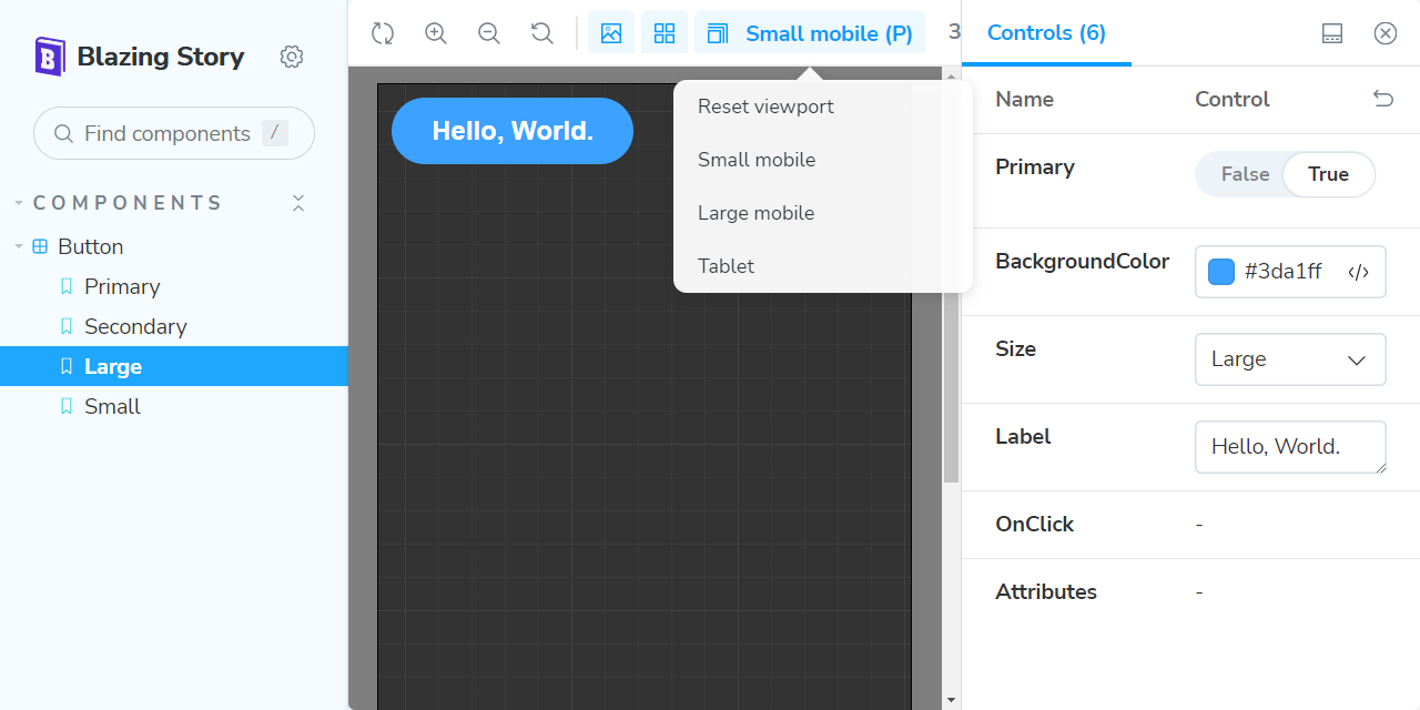
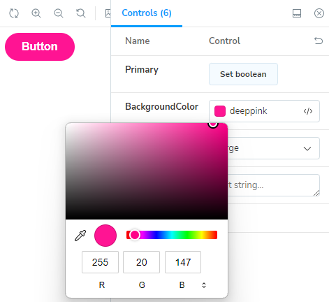
For example, if you apply the ControlType.Color control type to the BackgroundColor parameter like this,
<Stories TComponent="Button">
    <ArgType For="_ => _.BackgroundColor" Control="ControlType.Color" />
    ...
you will be able to specify the component's background color with the color picker, like in the following picture.
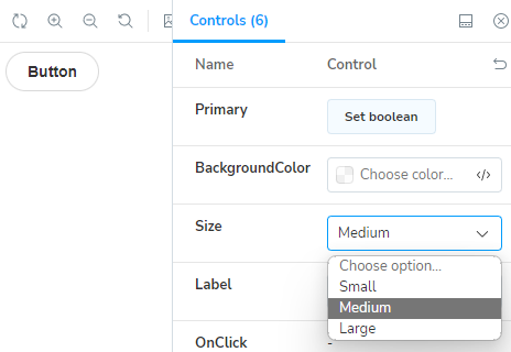
For another example, you can make the "Control" panel use dropdown list control to choose one of the values of the enum type instead of the radio button group control, with the following code.
<Stories TComponent="Button">
    ....
    <ArgType For="_ => _.Size" Control="ControlType.Select" />
    ...
Then, you will get the result in the following picture.
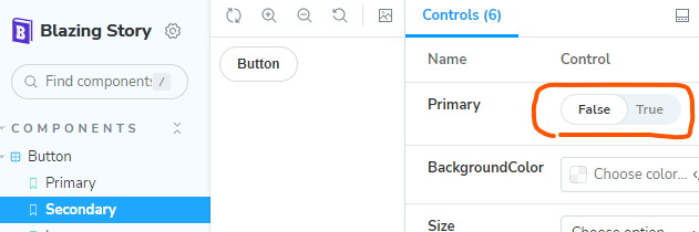
Configure the initial value of the component parameter
You can specify the initial value of the component parameter by using the <Arg> component inside the <Arguments> render fragment parameter of the <Story> component like this:
    ...
    <Story Name="Secondary">
        <Arguments>
            <Arg For="_ => _.Primary" Value="false" />
        </Arguments>
        ...
Configure component parameters which type is RenderFragment
Blazing Story supports the RenderFragment type parameter in its control panel. For example, if you have a story for a component such as having a RenderFragment ChildContent parameter, you can dynamically set text to that ChildContent parameter from the control panel UI at runtime.
(NOTICE: Currently, Blazing Story allows you to set only text to the RenderFragment type parameter in its control panel UI. You cannot set fragments consisting of other components or HTML tags to the RenderFragment type parameter. This is a limitation of Blazing Story.)
However, if you mark up the ChildContent parameter inside of the component's markup, you will not be able to set text to that parameter from the control panel UI. Because the ChildContent parameter is already set with the component's markup.
    ...
    <Story Name="Default">

        <Template>
            <MyButton @attributes="context.Args">

                Click me
            </MyButton>
        </Template>
        ...
Instead, you should set the ChildContent parameter through the <Arguments> render fragment parameter of the <Story> component, like below.
    ...
    <Story Name="Default">

        <Arguments>
            <Arg For="_ => _.ChildContent" Value="_childContent" />
        </Arguments>

        <Template>
            <MyButton @attributes="context.Args">
            </MyButton>
        </Template>
        ...
@code
{
    RenderFragment _childContent = @<text>Click me</text>;
}
✍️ Documentation Enhancement
By default, no detailed descriptions are in the "Docs" pages on "Blazing Story".
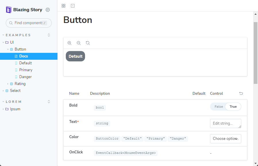
To add more detailed descriptions to "Docs" pages, first of all, write down a summary of component parameters into your UI component's .razor file with an "XML document comment" format, like below.
@code {
    ...
    // 👇 Add these triple slash comments.
    //    See also: https://learn.microsoft.com/dotnet/csharp/language-reference/xmldoc/

    /// <summary>
    /// Set a text that is button caption.
    /// </summary>
    [Parameter, EditorRequired]
    public string? Text { get; set; }

    /// <summary>
    /// Set a color of the button. <see cref="ButtonColor.Default"/> is default.
    /// </summary>
    [Parameter]
    public ButtonColor Color { get; set; } = ButtonColor.Default;
    ...
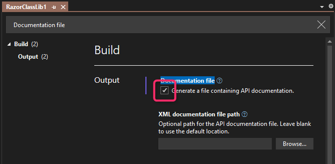
And next, enable generating an XML documentation file in your UI component library's project file (.csproj).
If you are working on Visual Studio, you can do that by turning on the option `Documentation file - Generate a file containing API documentation" from the property GUI window of the project (You can find that option in the "Build" > "Output" category. You can also find it more easily by searching with the "Documentation file" keyword inside the project property GUI window).
Or, you can also do that by adding the <GenerateDocumentationFile> MSBuild property with true in a project file (.csproj) of your UI component library, like below.
<Project Sdk="Microsoft.NET.Sdk.Razor">
  <PropertyGroup>
    ...

    <GenerateDocumentationFile>True</GenerateDocumentationFile>
    ...
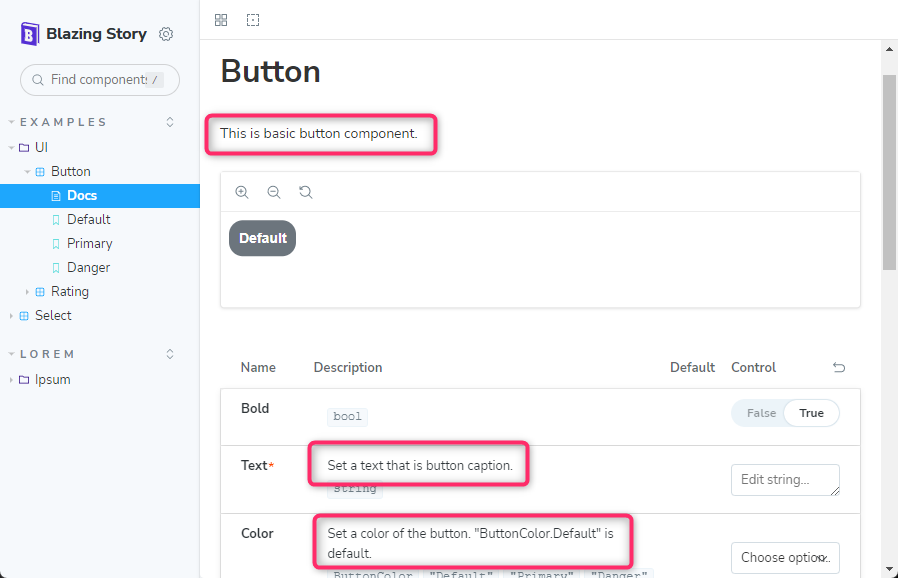
After doing that, you will see those added XML document comments are appeared in the "Docs" pages.
Note
Currently, to add the description for the component itself, not for each parameter's descriptions, you will have to add a partial class file of the .razor file.
For example, if you have the "Button.razor" Razor component file, then you will have to add the "Button.razor.cs" file to the project and write down the summary of the component in the "...razor.cs" file, like below.
// 📄 This is a partial class file "Button.razor.cs"
//     of the "Button.razor" Razor component file.

// 👇 Add the triple slash comments to the component class.

/// <summary>
/// This is basic button component.
/// </summary>
public partial class Button
{
}
⚙️ Configure prefers color scheme
By default, the "Blazing Story" app respects the system's color scheme, such as "dark" or "light". If you want to keep the "Blazing Story" app's color scheme to be either "dark" or "light" regardless of the system's color scheme, you can do that by setting the AvailableColorScheme parameter of the BlazingStoryApp component in your App.razor file.
If you set that parameter with Dark or Light, except Both, the "Blazing Story" app will be displayed with the specified color scheme regardless of the system's color scheme.
@* 📄 App.razor *@
<BlazingStoryApp
    Assemblies="[typeof(App).Assembly]"
    AvailableColorSchemes="AvailableColorSchemes.Light">
    @* This app will be displayed "light" mode only 👆*@
</BlazingStoryApp>
🪄 Include custom CSS or JavaScript files for your stories
If you need to add <link> or <script> elements to include CSS or JavaScript files for canvas views of your stories, you should do that in the iframe.html file, not in the index.html file.
🎀 Customize the title and brand logo
Customize the title
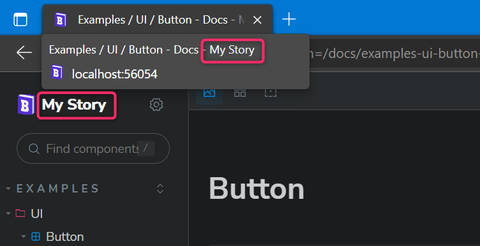
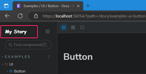
If you want to customize the title of your Blazing Story app, set the Title parameter of the BlazingStoryApp component in your App.razor file.
@* 📄 App.razor *@
<BlazingStoryApp Title="My Story" ...>
</BlazingStoryApp>
The string value specified in the Title parameter of the BlazingStoryApp will appear in the title of your Blazing Story app document and in the brand logo area placed at the top of the sidebar.
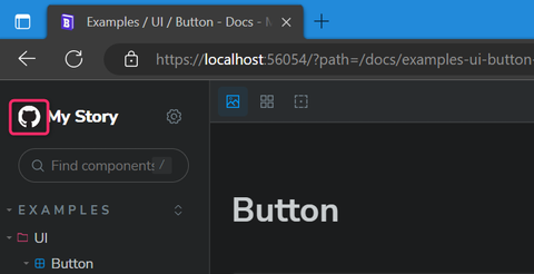
Customize the brand logo
You can also replace the brand logo contents at the top of the sidebar entirely by marking up the BrandLogoArea render fragment parameter of the BlazingStoryApp component, like below.
@* 📄 App.razor *@
<BlazingStoryApp Title="My Story" ...>


    <BrandLogoArea>
        <div style="font-family:'Comic Sans MS';">
            @context.Title
        </div>
    </BrandLogoArea>

</BlazingStoryApp>
You can refer to the BlazingStoryApp component instance via the context argument, so you can retrieve the title string, which is specified in the Title parameter of the BlazingStoryApp component.
Note
The 'BlazingStoryApp' component instance is also provided as a cascade parameter value. So you can get the reference to the instance of theBlazingStoryAppcomponent anywhere in your Razor component implemented in your Blazing Story app.
If you want to only customize the logo icon or the URL of the link, not want to change the entire brand logo HTML contents, you can use the BrandLogo built-in component instead. The BrandLogo component will render the default design of the brand logo of the Blazing Story app and expose some parameters, such as IconUrl, Url, and Title, to customize them.
@* 📄 App.razor *@
<BlazingStoryApp Title="My Story" ...>
    <BrandLogoArea>
        <BrandLogo IconUrl="https://github.githubassets.com/apple-touch-icon-76x76.png" Url="..." />
    </BrandLogoArea>
</BlazingStoryApp>
Note
TheBrandLogocomponent uses theTitleparameter of theBlazingStoryAppcomponent by default for rendering the title text inside it. But if theBrandLogocomponent'sTitleparameter is specified, theBrandLogocomponent uses it rather than theTitleparameter of theBlazingStoryAppcomponent.
🔥 Hot Reloading [Preview] [Unstable]
Unfortunately, the hot reloading feature won't work well on the "Blazing Story". Now, contributors are working on enabling the hot reloading feature for Blazing Story, but it is not completed yet.
However, if you want to try it, you can do that by setting the EnableHotReloading parameter of the BlazingStoryApp component to true explicitly in your App.razor file.
<BlazingStoryApp EnableHotReloading="true">

</BlazingStoryApp>
After doing that, you will see the changes you made in the "stories" files, and component library projects will be reflected in the preview area of "Blazing Story" without restarting the app.
But please remember that it is really unstable. In our experience, it doesn't work on a "Doc" page. Visiting a "Doc" page often stops the entire "Blazing Story" app. Once it happens, there is no way to recover it except to re-launch the app as far as we know (when you use the dotnet watch command, hit Ctrl + R).
Therefore, the hot reloading feature is still a preview feature. We are working on it, but we cannot guarantee that it will work well in the future.
📌 System Requirements
.NET SDK ver.7 or later
🙇 Disclaimer
The "Blazing Story" is just my hobby work and a personal technical exhibition, so it is not an officially derived product from the "Storybook". I'd like to keep improving this product for now, but it might be abandoned if I cannot spend enough time on this product in the future. I welcome that somebody forks this product and organizes the maintainers for it.
From another perspective, the "Blazing Story" is an almost 100% Blazor-native application that re-implemented Storybook's look, behavior, and functionality to mimic it. However, this means that none of the Storybook community's contributions, numerous add-ins, and related services are available in the "Blazing Story".
Therefore, the combination of Blazor's WebComponents custom element and Storybook might be more promising for the future of UI component catalog solutions for Blazor application development than the "Blazing Story".
However, on the "Blazing Story" side, Blazor application developers can get a Storybook-like UI component catalog solution under the familiar .NET ecosystem without being annoyed by a complex JavaScript front-end development toolchain. This is the most important point I wanted to illustrate through the development of Blazing Story.
🤔 Frequently Asked Questions
Q1: Can I run a Blazing Story app as a Blazor Server app?
A1: Almost, yes, you can. However, running a Blazing Story app as a Blazor Server has yet to be fully supported. We are working on it, but it still needs to be completed.
Q2: How can I write or configure addons?
A2: You can't do that for now because the addon architecture is not completed yet. I'll finish it in the future version.
🎉 Release Notes
Release notes are here.
⚠️ Attention
Assembly files of the Blazing Story app include the project file path string that the app was built as its metadata.
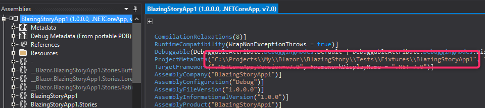
If you need the path to the project should be secret, you may have to avoid using Blazing Story.
📢 License & Third Party Notice
Mozilla Public License Version 2.0
The third party notice is here.
This package has no dependencies.
NuGet packages
This package is not used by any NuGet packages.
GitHub repositories
This package is not used by any popular GitHub repositories.
v.1.0.0-preview.31
- Improve: Add an ability to reference application projects, not class libraries
- Improve: XML doc comments are now fetched even when it is running on a Blazor Server project
To see all the change logs, please visit the following URL.
- https://github.com/jsakamoto/BlazingStory/blob/main/RELEASE-NOTES.txt