AlohaKit 1.0.0
See the version list below for details.
dotnet add package AlohaKit --version 1.0.0
NuGet\Install-Package AlohaKit -Version 1.0.0
<PackageReference Include="AlohaKit" Version="1.0.0" />
paket add AlohaKit --version 1.0.0
#r "nuget: AlohaKit, 1.0.0"
// Install AlohaKit as a Cake Addin #addin nuget:?package=AlohaKit&version=1.0.0 // Install AlohaKit as a Cake Tool #tool nuget:?package=AlohaKit&version=1.0.0
AlohaKit
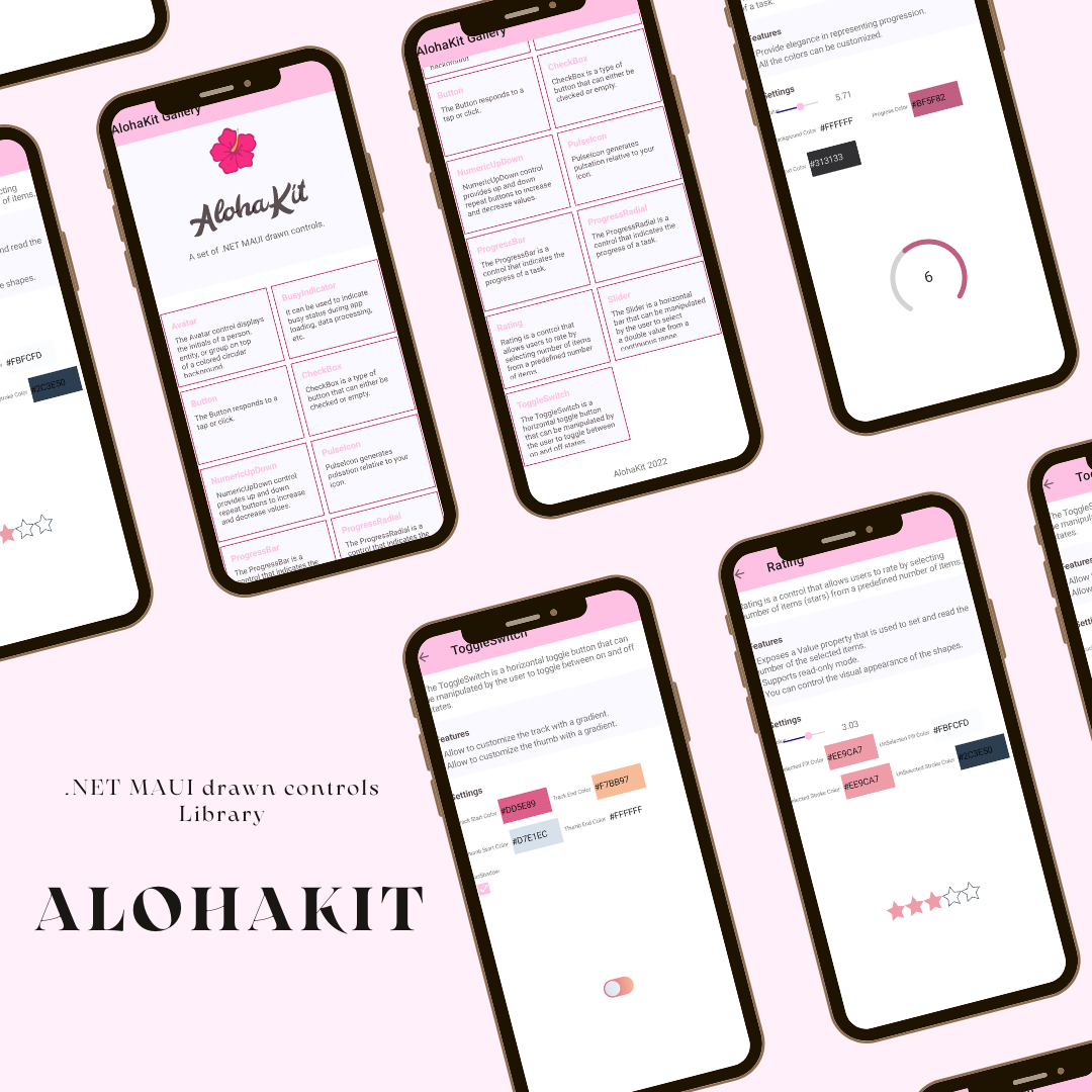
A set of .NET MAUI drawn controls.
Usage
Step 1: Include the AlohaKit package reference in your project.
Step 2: Enjoy coding!.
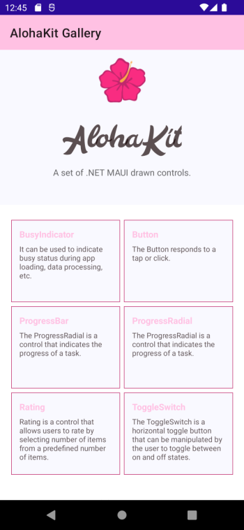
Controls
The controls available are:
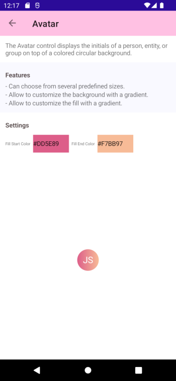
Avatar
The Avatar control displays the initials of a person, entity, or group on top of a colored circular background.
Features:
- Can choose from several predefined sizes.
- Allow to customize the background with a gradient.
- Allow to customize the fill with a gradient.
Button
The Button responds to a tap or click.
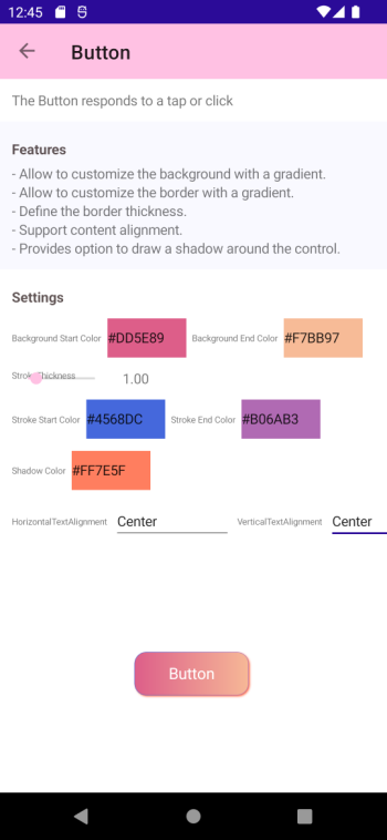
Features:
- Allow to customize the background with a gradient.
- Allow to customize the border with a gradient.
- Define the border thickness.
- Support content alignment.
- Provides option to draw a shadow around the control.
BusyIndicator
It can be used to indicate busy status during app loading, data processing, etc.
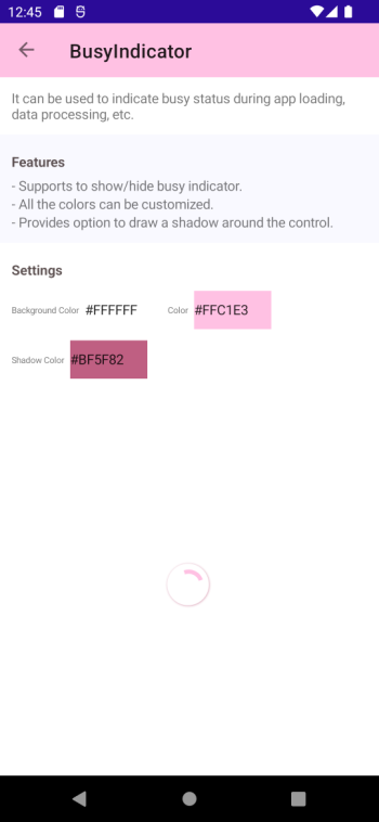
Features:
- Supports to show/hide busy indicator.
- All the colors can be customized.
- Provides option to draw a shadow around the control.
CheckBox
CheckBox is a type of button that can either be checked or empty.
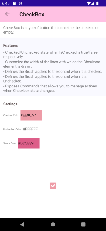
Features:
- Checked/Unchecked state when IsChecked is true/false respectively.
- Customize the width of the lines with which the Checkbox element is drawn.
- Defines the Brush applied to the control when it is checked.
- Defines the Brush applied to the control when it is unchecked.
- Exposes Commands that allows you to manage actions when Checkbox state changes.
PulseIcon
PulseIcon generates pulsation relative to your icon.
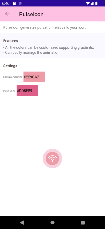
Features:
- All the colors can be customized supporting gradients.
- Can easily manage the animation.
ProgressBar
The ProgressBar visually represents progress as a horizontal or vertical bar that is filled to a percentage represented by a float value.
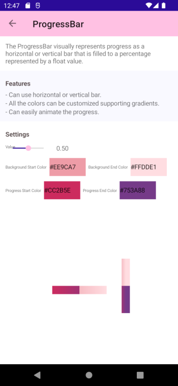
Features:
- Can use horizontal or vertical bar.
- All the colors can be customized supporting gradients.
- Can easily animate the progress.
ProgressRadial
The ProgressRadial is a control that indicates the progress of a task.
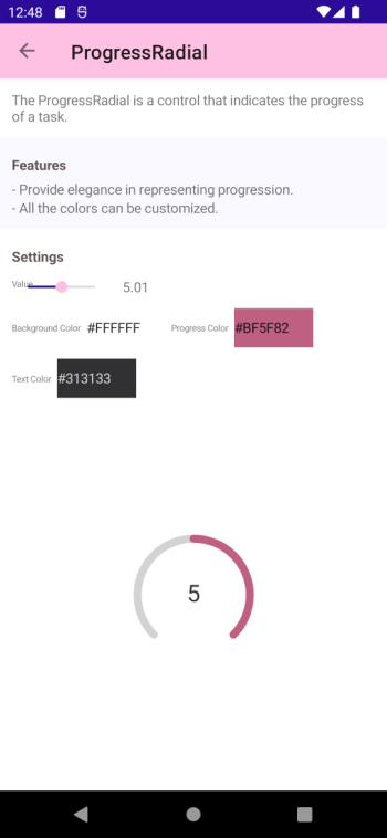
Features:
- Provide elegance in representing progression.
- All the colors can be customized.
Rating
Rating is a control that allows users to rate by selecting number of items (stars) from a predefined number of items.
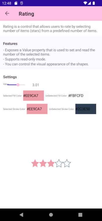
Features:
- Exposes a Value property that is used to set and read the number of the selected items.
- Supports read-only mode.
- You can control the visual appearance of the shapes.
Slider
Slider is a horizontal bar that can be manipulated by the user to select a double value from a continuous range.
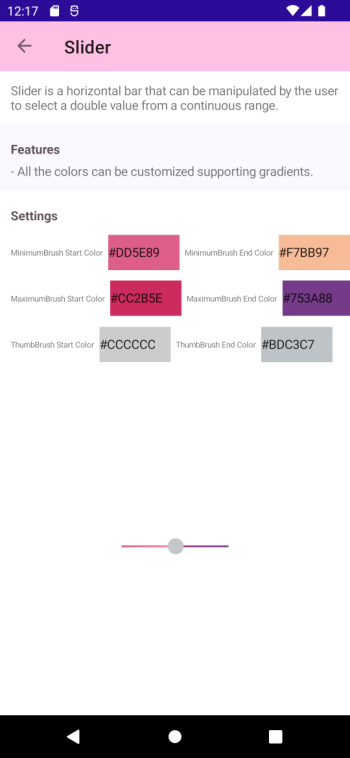
Features:
- All the colors can be customized supporting gradients.
ToggleSwitch
The ToggleSwitch is a horizontal toggle button that can be manipulated by the user to toggle between on and off states.
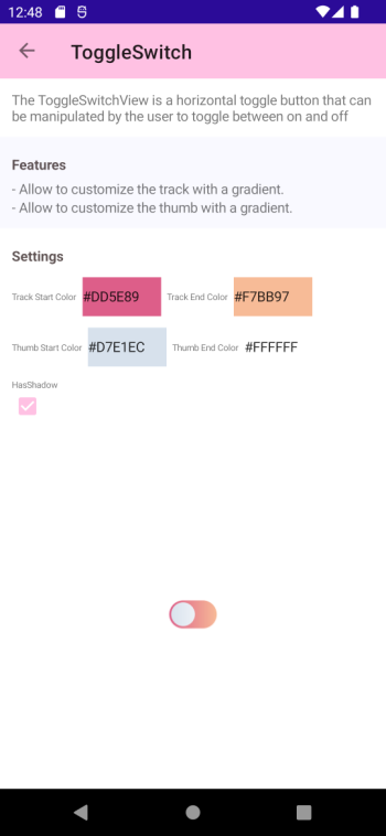
Features:
- Allow to customize the track with a gradient.
- Allow to customize the thumb with a gradient.
Contribute
Do you want to contribute?.
Found a Bug?
If you find a bug, you can help me by submitting an issue. Even better, you can submit a Pull Request with a fix.
Submitting a pull request
For every contribution, you must:
- Test your code.
- target main branch (or an appropriate release branch if appropriate for a bug fix).
Feedback or Requests
Use GitHub Issues for bug reports and feature requests.
Principles
- Principle #1: Kept AlohaKit simple.
- Principle #2: Any control added must be a drawn control and allow to extend and customize everything.
Copyright and license
Code released under the MIT license.
| Product | Versions Compatible and additional computed target framework versions. |
|---|---|
| .NET | net6.0 is compatible. net6.0-android was computed. net6.0-android31.0 is compatible. net6.0-ios was computed. net6.0-ios15.4 is compatible. net6.0-maccatalyst was computed. net6.0-maccatalyst15.4 is compatible. net6.0-macos was computed. net6.0-tvos was computed. net6.0-windows was computed. net6.0-windows10.0.19041 is compatible. net7.0 was computed. net7.0-android was computed. net7.0-ios was computed. net7.0-maccatalyst was computed. net7.0-macos was computed. net7.0-tvos was computed. net7.0-windows was computed. net8.0 was computed. net8.0-android was computed. net8.0-browser was computed. net8.0-ios was computed. net8.0-maccatalyst was computed. net8.0-macos was computed. net8.0-tvos was computed. net8.0-windows was computed. |
-
net6.0
- Microsoft.Maui.Dependencies (>= 6.0.400-preview.1.5812)
- Microsoft.Maui.Extensions (>= 6.0.400-preview.1.5812)
-
net6.0-android31.0
- Microsoft.Maui.Dependencies (>= 6.0.400-preview.1.5812)
- Microsoft.Maui.Extensions (>= 6.0.400-preview.1.5812)
-
net6.0-ios15.4
- Microsoft.Maui.Dependencies (>= 6.0.400-preview.1.5812)
- Microsoft.Maui.Extensions (>= 6.0.400-preview.1.5812)
- System.Runtime.InteropServices.NFloat.Internal (>= 6.0.1)
-
net6.0-maccatalyst15.4
- Microsoft.Maui.Dependencies (>= 6.0.400-preview.1.5812)
- Microsoft.Maui.Extensions (>= 6.0.400-preview.1.5812)
- System.Runtime.InteropServices.NFloat.Internal (>= 6.0.1)
-
net6.0-windows10.0.19041
- Microsoft.Maui.Dependencies (>= 6.0.400-preview.1.5812)
- Microsoft.Maui.Extensions (>= 6.0.400-preview.1.5812)
NuGet packages
This package is not used by any NuGet packages.
GitHub repositories (1)
Showing the top 1 popular GitHub repositories that depend on AlohaKit:
| Repository | Stars |
|---|---|
|
roubachof/Sharpnado.CollectionView
A performant list view supporting: grid, horizontal and vertical layout, drag and drop, and reveal animations.
|