Xceed.Product.Maui.Toolkit.Full
1.7.24157.1331
dotnet add package Xceed.Product.Maui.Toolkit.Full --version 1.7.24157.1331
NuGet\Install-Package Xceed.Product.Maui.Toolkit.Full -Version 1.7.24157.1331
<PackageReference Include="Xceed.Product.Maui.Toolkit.Full" Version="1.7.24157.1331" />
paket add Xceed.Product.Maui.Toolkit.Full --version 1.7.24157.1331
#r "nuget: Xceed.Product.Maui.Toolkit.Full, 1.7.24157.1331"
// Install Xceed.Product.Maui.Toolkit.Full as a Cake Addin
#addin nuget:?package=Xceed.Product.Maui.Toolkit.Full&version=1.7.24157.1331

// Install Xceed.Product.Maui.Toolkit.Full as a Cake Tool
#tool nuget:?package=Xceed.Product.Maui.Toolkit.Full&version=1.7.24157.1331


Update 1.7
We keep adding more, here's 6 new controls
Update 1.6
Update 1.5
Table of Contents
Controls:
All controls are compatible with:

<a id="introduction"></a>
Xceed is excited to introduce its new Toolkit for MAUI!
We're thrilled to introduce our new Toolkit for MAUI, an open-source and free version that includes additional controls and features to supplement the existing "basic controls". Our goal is to provide developers with the tools they need to create exceptional user experiences.
Our toolkit is designed with developers in mind, and we've taken care to make it as user-friendly and intuitive as possible. Whether you're an experienced developer or just getting started, you'll find that our controls and features are easy to use and integrate seamlessly into your projects.
With MAUI's cross-platform capabilities, you can develop applications that work seamlessly on Windows, Android, Mac, and iOS, without the need for separate code bases. We're committed to ensuring that our toolkit is compatible with all MAUI-supported platforms and that the experience is identical across all of them.
For those familiar with WPF, this toolkit will feel familiar, and we've made every effort to create a seamless transition for you. Our goal is to provide a comfortable and intuitive experience, making it easy to get started and get productive quickly.
Currently, the toolkit includes a range of controls, with more to come in the future. These controls include an improved Border, Button, RepeatButton, ButtonSpinner, a series of NumericUpDown, ToggleButton, ContentControl, Card control, all these controls includes 48 accent colors for each control. We're committed to continually improving and updating the toolkit to meet the evolving needs of developers.
Thank you for considering Xceed's Toolkit for MAUI. We're excited to see what you create with it! Meanwhile, here’s more information on the controls we provide:
<a id="chart"></a>
Chart
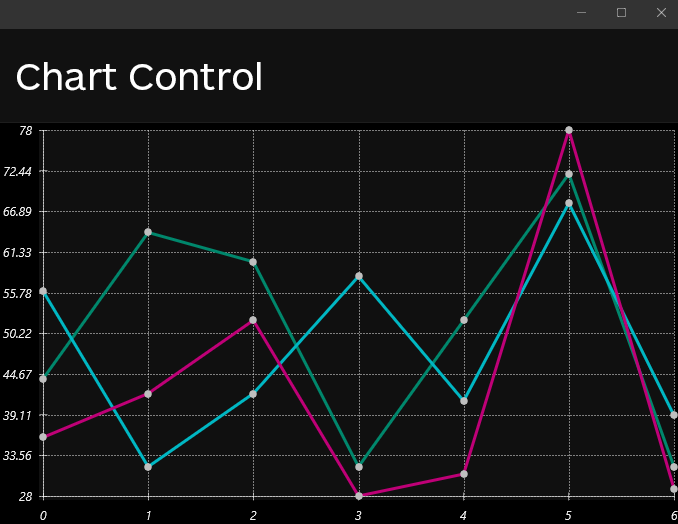
Our Chart Control allows you to build simple and beautiful charts with very little effort. You can customize the following elements :
- Horizontal and vertical Axis,
- Show grid lines,
- Modify ticks text,
- Switch from Bar or Line chart,
- Multiple series in one chart,
- Redifine de datapoint Markers,
- Create a custom legend.
Here's a quick code sample to get you started:
<xctk:Chart x:Name="MyChart"
            Grid.Row="1">
  <xctk:Chart.HorizontalAxis>
    <xctk:Axis TickLabelType="Text" />
  </xctk:Chart.HorizontalAxis>
  <xctk:Chart.Series>
    <xctk:Series x:Name="FirstSeries">
      <xctk:Series.DataPoints>
        <xctk:DataPoint Text="0"
                        Y="44" />
        <xctk:DataPoint Text="1"
                        Y="64" />
        <xctk:DataPoint Text="2"
                        Y="60" />
        <xctk:DataPoint Text="3"
                        Y="32" />
        <xctk:DataPoint Text="4"
                        Y="52" />
        <xctk:DataPoint Text="5"
                        Y="72" />
        <xctk:DataPoint Text="6"
                        Y="32" />
      </xctk:Series.DataPoints>
    </xctk:Series>
  </xctk:Chart.Series>
</xctk:Chart>
<a id="calendar"></a>
Calendar
Choose dates effortlessly with a control similar to the WPF, which allows selection by month, year, or decade. It supports specifying SelectedDates and BlackoutDates, providing flexibility in choosing single dates, ranges, or multiple ranges to meet your scheduling needs.
<xctk:Calendar ="MultiRange"
               IsTodayHighlighted="True"
               SelectedDatesChanged="Calendar_SelectedDatesChanged"/>
<a id="popup"></a>
PopUp
A control allows for displaying any View on top of everything else, offering both modal and non-modal popup options. The latter closes with a click outside. You can position the popup in various locations: TopLeft, Top, TopRight, Right, BottomRight, Bottom, BottomLeft, or Left, relative to the Window, the popup's parent, or an Anchor View object. The IsOpen property is used to open or close the popup, with Open()/Close() methods available for straightforward operation. Additionally, Opened and Closed events are provided for effective application integration.
<a id="dropdownbutton"></a>
DropDownButton
A control designed for click interaction, opening a popup that can contain any View. It automatically closes when clicking outside the popup. The location of the popup can be customized to appear on any corner or side of the DropDownButton, with the option to set a maximum popup height. It includes Opened and Closed events for easy tracking of the popup's state.
<a id="datetimeupdown"></a>
DateTimeUpDown
A control similar to the NumericUpDown, but designed for adjusting date portions with Up/Down actions. Keyboard left and right navigation enables shifting between different date segments, enhancing the user's interaction and efficiency in date selection. You can also adjust the Date Format to be any of the predefined formats or use a custom one.
<a id="autocompletetextbox"></a>
AutoCompleteTextBox
A control, derived from our TextBox (retaining all its properties), enables the provision of an ItemsSource and a FilterType to display a popup that filters data based on current input. It supports filtering methods such as Contains, StartsWith, Equals, and more. An ItemTemplate property allows for customized display of popup elements according to your preferences.
<a id="calculator"></a>
Calculator
A control designed to display a calculator complete with buttons for performing calculations. All buttons are stylizable, and the precision of decimal calculations can be adjusted to meet specific requirements.
<a id="colorcanvas"></a>
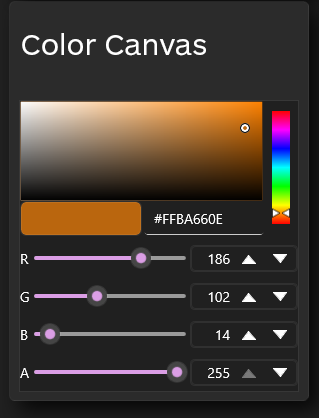
ColorCanvas
The ColorCanvas control facilitates intuitive color selection in applications. It offers a simple graphical interface with including ColorSpectrum for seamless color picking.
<a id="textbox"></a>
TextBox
The TextBox control is a versatile input element offering advanced features not available in the basic controls in MAUI. Including :
Underline Removal: Option to remove underlines typically associated with standard text input controls.
Corner Radius Customization: Ability to set corner radius for rounded or customized corners, enhancing visual appeal.
Border Customization: Modify border properties, including thickness and color, to suit application design.
Non-proportional ClearButton: A ClearButton that does not follow proportional sizing, providing design flexibility.
Custom Watermark: Support for diverse watermark types instead of just strings, offering a more dynamic UI.
ClearButton Styling: Ability to style the ClearButton to match the overall design of the application.
<a id="maskedtextbox"></a>
MaskedTextBox
The MaskedTextBox allows you to use the same functionalities that you find in the textbox while adding support for a mask, here's a few examples of mask you can use and how they look like:
 <xctk:MaskedTextBox Margin="0,8,0,0"
                     Mask="(000)000-0000"
                     ClearButtonVisibility="WhileEditing"
                     WidthRequest="160"/>

  <xctk:MaskedTextBox Margin="0,8,0,0"
                     CornerRadius="0"
                     Mask="000.000.000.000"
                     ClearButtonVisibility="WhileEditing"
                     WidthRequest="160" />
<a id="switch"></a>
ToggleSwitch
The ToggleSwitch is an advanced control that enhances the standard Switch from the MAUI framework. Allowing customization of size, borders, content, and thumb appearance based on the Checked or Unchecked state. Here's a quick list of features:
- Ability to set a size as well as BorderThickness, BorderBrush, CornerRadius
- Modify elements when Checked/Unchecked (Background, ThumbContent, Content)
- Configure the Thumb (Background, BorderBrush, BorderThickness, Content)
- Choose the side when Checked
- and of course all features that area already available in the MAUI Switch control.
<a id="filepicker"></a>
FilePicker
The FilePicker control offers a seamless and unified file selection functionality across all platforms. Whether you're developing for Windows, iOS, or any other supported platform, this control integrates effortlessly.
To incorporate the FilePicker into your application, simply add it to your XAML:
<xctk:FilePicker Watermark="File Picker" />
And you will then have access to a selectedfile(s) property. The control supports both single or multiple files selection.
<a id="expander"></a>
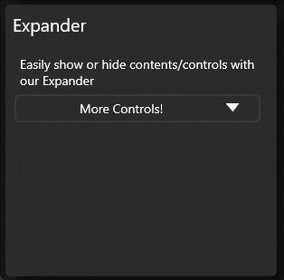
Expander
The Expander is a versatile control designed to improve the user interface by enabling the expansion and collapse of content in either a downward or upward direction. It provides a clean and intuitive way to manage and display additional information, enhancing user experience and interface organization. Users can easily expand to view more details or collapse to save space, offering flexibility in how information is presented within the application.
To use, simply set the content property on the control to what you wish, you can use the header property to change the button's caption.
<a id="checkbox"></a>
CheckBox
The CheckBox is an enhanced version of the standard CheckBox control, providing additional features and flexibility. Key features include:
- Tri-State Functionality: Supports three states - true, false, or indeterminate, offering more options for representing data.
- Customizable Size and Appearance: Allows customization of size, box style, border, corner radius, and padding, providing design flexibility.
- Content Support: Allows inclusion of content within the CheckBox, enabling a more informative and interactive user interface.
- Custom Symbols: Enables customization of symbols for checked, indeterminate, and unchecked states, allowing for a personalized look and feel.
These features enhance the usability and visual customization of the Xceed CheckBox, making it a valuable component for building interactive UIs.
<a id="radiobutton"></a>
RadioButton
Just like the CheckBox control, the RadioButton is an enhanced version of the standard RadioButton control, providing additional features and flexibility.
 <xctk:RadioButton Content="RadioButton 1"
                   IsChecked="True" />
 <xctk:RadioButton Content="RadioButton 2"
                   IsChecked="False"/>
 <xctk:RadioButton Content="RadioButton 3"
                   IsChecked="False"/>
<a id="border"></a>
Border
One of the issues we have with the basic border control offered in MAUI is the lack of having independent corner radius as an example, we fixed that, here’s a list of additional features:
- A BorderBrush property of type Brush, instead of Stroke of type Brush.
- A BorderThickness property of type Thickness, instead of StrokeThickness of type double (for independent borders).
- A CornerRadius property of type CornerRadius (for rounded corners).
- The Content's Labels benefit from the FontSize, FontAttributes, FontFamily, and TextColor properties.
Here's an example on how to set earch CornerRadius independantly
<xctk:Border CornerRadius="40,0,40,0" />
<a id="button"></a>
Button

The default .NET MAUI Framework Button did not include some essential features such as MouseOver and pressed styles (as shown in the screenshot above), and did not allow for the addition of custom content, such as images layouted in particular ways. We have addressed these limitations with our custom Button implementation, which includes the following features:
- BorderBrush (type Brush) for more flexibility than BorderColor of type Color.
- BorderThickness (type Thickness) to allow for independent borders rather than BorderWidth of type double.
- ClickMode to trigger the Clicked event on a Press or Release.
- Content (type object) to display the user's View or a Label if they pass a string.
- CornerRadius (type CornerRadius) for independently rounded corners rather than int.
- HorizontalContentAlignment (type LayoutOptions) to align content horizontally.
- VerticalContentAlignment (type LayoutOptions) to align content vertically.
- ContentTemplate (from ContentControl) to configure the content.
- Labels in Content can use properties such as FontSize, FontAttributes, FontFamily, and TextColor.
- PointerOver and PointerPressed.
Note: The BorderColor property has been removed as Background already exists.
With our custom Button implementation, you can create highly flexible and customizable buttons for your .NET MAUI apps.
<a id="togglebutton"></a>
ToggleButton
MAUI currently does not include the ToggleButton control. Therefore, we have created one that has the same functionalities as our button. However, we added a simple yet useful feature to the ToggleButton: a "IsChecked" property that gives the button a "pressed" appearance. We believe that this feature can be helpful for users who are familiar with this control. Moreover, implementing this feature was not complicated, and it enhances the overall user experience of our library.
<a id="repeatbutton"></a>
RepeatButton
We have created a new control called RepeatButton, which is derived from the Xceed Button. This control includes the Delay and Interval properties, which allow the Clicked event to be raised more than once.
The RepeatButton control is similar to a standard button, but it provides the additional functionality of allowing the Clicked event to be raised repeatedly while the button is pressed. The Delay and Interval properties control the amount of time before the first repeated Clicked event is raised, and the frequency of subsequent events, respectively.
With the RepeatButton control, you can create more responsive and interactive user interfaces in your .NET MAUI apps. <a id="numericupdown"></a>
NumericUpDown
Using our very own ButtonSpinner, we offer a series of brebuilt control for you to use, these controls includes:
- ByteUpDown
- DecimalUpDown
- DoubleUpDown
- IntegerUpDown
- LongUpDown
- SByteUpDown (integers with values ranging from negative 128 to positive 127)
- ShortUpDown
- SingleUpDown (for float)
- UIntegerUpDown (unsigned integer in the range of 0 to 4,294,967,295)
- ULongUpDown (unsigned integer in the range of 0 to 18,446,744,073,709,551,615)
- UShortUpDown (unsigned integer value between the range of 0 to 65,535)
These controls should make our users lives easier when dealing with different datatype.
<a id="contentcontrol"></a>
ContentControl
We have created a new control called ContentControl, which allows you to set the content and its associated DataTemplate.
The ContentControl is a versatile control that can display any type of content, including text, images, and other controls. By setting the Content property, you can specify the content to be displayed, and by setting the ContentTemplate property, you can specify how the content should be displayed.
The DataTemplate allows you to define a layout for the content, including styles and formatting. By using the ContentControl in conjunction with DataTemplates, you can create highly customized and dynamic user interfaces in your .NET MAUI apps.
<a id="buttonspinner"></a>
ButtonSpinner
We have created a new control called ButtonSpinner, which is derived from the ContentControl. This control allows you to display content along with two RepeatButtons (Spinners) and includes several useful properties and events.
The ButtonSpinner control includes the following properties:
- AllowSpin: controls whether the Spinners are allowed to raise events.
- SpinnerDownContentTemplate and SpinnerUpContentTemplate: specify the DataTemplates for the Spinners.
- SpinnerLocation: determines the location of the Spinners (either left or right of the content).
- ValidSpinDirection: specifies the allowed spin direction (either up or down).
- In addition to these properties, the ButtonSpinner control raises a Spin event when the RepeatButtons are clicked or held down. This event can be used to respond to user input and update the content as needed.
With the ButtonSpinner control, you can create highly interactive and customizable UI components in your .NET MAUI apps.
<a id="card"></a>
Card
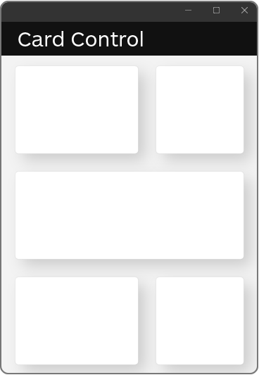
We have created a new control called the Card Control, which provides a visually appealing way to display content in your .NET MAUI apps.
The Card Control is a frame with a subtle shadow effect, which creates the illusion of depth and makes the content stand out from the background. This makes it an ideal choice for displaying important information or creating a visually striking user interface.
With the Card Control, you can easily add depth and visual interest to your .NET MAUI apps without the need for complex styling or layout. Simply add the control to your XAML code and specify the content to be displayed within it.
<a id="getting-started"></a>
Getting Started
The first thing you will want to do is get the package on NuGet or simply clone the project and add it to your references. Once this is done, you will need to add a reference to the Xceed namespace :
xmlns:xctk="clr-namespace:Xceed.Maui.Toolkit;assembly=Xceed.Maui.Toolkit"
or
xmlns:xctk="http://schemas.xceed.com/maui/xaml/toolkit"
Then, you will need to add our ResourceDictionary to your app or page :
<Application.Resources>
    <ResourceDictionary>
      <ResourceDictionary.MergedDictionaries>
        <xctk:FluentDesign AccentColor="Pink" />
      </ResourceDictionary.MergedDictionaries>
    </ResourceDictionary>
  </Application.Resources>
You can also set it in your page:
<ContentPage>
     <ContentPage.Resources>
    <ResourceDictionary>
      <ResourceDictionary.MergedDictionaries>
        <xctk:FluentDesign AccentColor="Blue"/>
      </ResourceDictionary.MergedDictionaries>
    </ResourceDictionary>
    ...
   </ContentPage>
Or through code during the creation of the MauiApp, using a call to UseXceedMauiToolkit()
public static class MauiProgram
:
  {
    public static MauiApp CreateMauiApp()
    {
      var builder = MauiApp.CreateBuilder();
      builder
          .UseMauiApp<App>()
          .UseXceedMauiToolkit( FluentDesignAccentColor.DarkLily )
          .ConfigureFonts( fonts =>
          {
            fonts.AddFont( "OpenSans-Regular.ttf", "OpenSansRegular" );
            fonts.AddFont( "OpenSans-Semibold.ttf", "OpenSansSemibold" );
          } );
      return builder.Build();
    }
  }
Keep in mind that for this example we are using Pink. However, we offer a total of 48 different accent colors, each with its own variations. To see the complete list, you can type AccentColor="" to access the enumeration.
You can also add the following line in your Application declaration :
UserAppTheme="Dark"
This can also be done through code:
Application.Current.UserAppTheme = AppTheme.Dark;
If you wish to offer your users to switch between Light and Dark, you can use this line of code:
Application.Current.UserAppTheme = ( Application.Current.UserAppTheme == AppTheme.Dark) ? AppTheme.Light : AppTheme.Dark;
This will cycle between the light and dark theme.
Using Our Controls
Once you have added the code above, you are ready to start using Xceed Toolkit for .NET MAUI!
One thing you can try, that is not available by default in .NET MAUI, is adding Content to a button. If you are used to WPF, this will look very similar with what you would have done on that platform :
<xctk:Button HeightRequest="64"
                 WidthRequest="225">
      <HorizontalStackLayout>
        <Image Source="palm.png"
               HeightRequest="36"
               WidthRequest="36"
               Margin="0,0,8,0"/>
        <Label Text="Xceed MAUI Button"
               VerticalOptions="Center"/>
      </HorizontalStackLayout>
    </xctk:Button>
Of course, you will need to provide your own image. If for some reason, none of the controls show up on your app, most likely this is due to not having added the theme to your application :
<Application.Resources>
    <ResourceDictionary>
      <ResourceDictionary.MergedDictionaries>
        <xctk:FluentDesign AccentColor="Pink" />
      </ResourceDictionary.MergedDictionaries>
    </ResourceDictionary>
  </Application.Resources>
Custom Styling
Xceed Toolkit for MAUI does support custom styling, here is how to get started.
Create your own style that targets our control :
First make sure you add the reference to the FluentDesign dictionary
<Application.Resources>
    <ResourceDictionary>
      <ResourceDictionary.MergedDictionaries>
        <xctk:FluentDesign AccentColor="Gold" />
      </ResourceDictionary.MergedDictionaries>
    </ResourceDictionary>
</Application.Resources>
Them, you can create your own style :
 <Style TargetType="xctk:Button"
        BasedOn="{StaticResource FluentDesignButton}">
    <Setter Property="Background"
            Value="Red"/>
    <Setter Property="OverrideDefaultVisualStates"
            Value="True"/>
 </Style>
The BasedOn needs to be set to the name of our resource, here's the list of names you can use for other controls:
- FluentDesignBorder
- FluentDesignButton
- FluentDesignButtonSpinner
- FluentDesignCard
- FluentDesignRepeatButton
- FluentDesignCheckBox
- FluentDesignColorCanvas
- FluentDesignContentControl
- FluentDesignExpander
- FluentDesignFilePicker
- FluentDesignMaskedTextBox
- FluentDesignNumericUpDown
- FluentDesignRadioButton
- FluentDesignRepeatButton
- FluentDesignTextBox
- FluentDesignToggleButton
- FluentDesignToggleSwitch
- FluentDesignCalendar
- FluentDesignPopup
- FluentDesignDropDownButton
- FluentDesignAutoCompleteTextBox
- FluentDesignDateTimeUpDown
- FluentDesignCalculator
Note that the OverrideDefaultVisualStates will allow you to change the style of a Control while overriding our VisualStates.
Learn more about Target Frameworks and .NET Standard.
-
- Xceed.Maui.Toolkit (= 1.7.24157.1331)
NuGet packages
This package is not used by any NuGet packages.
GitHub repositories
This package is not used by any popular GitHub repositories.
| Version | Downloads | Last updated |
|---|---|---|
| 1.7.24157.1331 | 563 | 3/7/2024 |
| 1.6.23567.1403 | 1,459 | 11/17/2023 |
| 1.5.23517.727 | 965 | 10/17/2023 |
| 1.0.23273.1117 | 1,395 | 5/23/2023 |
v1.7.0 provides 6 new controls : AutoCompleteTextBox, Calendar, Calculator, DropDownButton, DateTimeUpDown and Popup. They are all fully flexible. In addition, some bug fixes for other controls are in. The MAUI Toolkit now runs on .NET8. Released March 7 2024.