MaterialDesignBoxes 1.0.4
dotnet add package MaterialDesignBoxes --version 1.0.4
NuGet\Install-Package MaterialDesignBoxes -Version 1.0.4
<PackageReference Include="MaterialDesignBoxes" Version="1.0.4" />
paket add MaterialDesignBoxes --version 1.0.4
#r "nuget: MaterialDesignBoxes, 1.0.4"
// Install MaterialDesignBoxes as a Cake Addin #addin nuget:?package=MaterialDesignBoxes&version=1.0.4 // Install MaterialDesignBoxes as a Cake Tool #tool nuget:?package=MaterialDesignBoxes&version=1.0.4
MaterialDesignBoxes
Material Message Box and Input Box for WPF.


❇️ Main Features
The message box has the following custom features:
✅ Material design message with predefined or custom colors
✅ Message box can contain checkbook
✅ Custom names for buttons (1-3 buttons)
✅ Option to copy message box text to clipboard
✅ Scrollable message box content
✅ Input box uses classical text input or combobox input
✅ Button for adding clipboard content into input box
❇️ Installing
▶️ Install from Package manager Console
$ Install-Package MaterialDesignBoxes
Or, if using dotnet
$ dotnet add package MaterialDesignBoxes
❇️ Usage (Screenshots)
add reference to App.xaml
 <Application.Resources>
    <ResourceDictionary>
        <ResourceDictionary.MergedDictionaries>
            <materialDesign:BundledTheme
                BaseTheme="Light"
                PrimaryColor="Red"
                SecondaryColor="Lime" />
            <ResourceDictionary Source="pack://application:,,,/MaterialDesignThemes.Wpf;component/Themes/MaterialDesignTheme.Defaults.xaml" />
        </ResourceDictionary.MergedDictionaries>
    </ResourceDictionary>
</Application.Resources>
add using statement
using MaterialDesignBoxes;
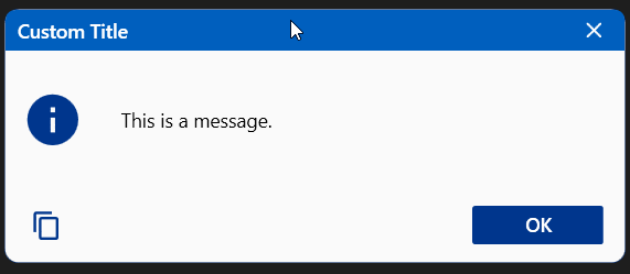
Using a default message box
MessageBox.Show($"This is a message.", "Custom Title", MessageBoxButton.OkOnly, MessageBoxIcon.Information, BoxesThemeColor.Blue, MessageBoxFocus.Button1);
or
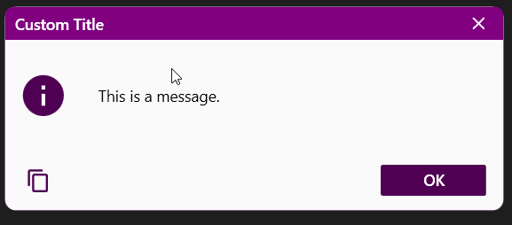
MessageBox.Show($"This is a message.", "Custom Title", MessageBoxButton.OkOnly, MessageBoxIcon.Information, Color.FromRgb(128, 0, 128), MessageBoxFocus.Button1);
or if you need the result
var outcome = MessageBox.Show($"This is a message.", "Custom Title", MessageBoxButton.YesNo, MessageBoxIcon.Question, BoxesThemeColor.Red, MessageBoxFocus.Button1);
if (outcome.Result == MessageBoxResult.Yes);
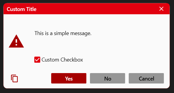
Using a message box with checkbox
var result = MessageBox.Show($"This is a simple message.", "Custom Title", MessageBoxButton.YesNoCancel, MessageBoxIcon.Warning, BoxesThemeColor.Red, MessageBoxFocus.Button1, checkBox: "Custom Checkbox");
if (result.Checkbox == MessageBoxCheckbox.Checked);
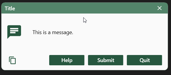
Using a message with custom buttons (1-3 custom bottons)
MessageBox.Show("This is a message.", "Title", button1: "Done");
MessageBox.Show("This is a message.", "Title", button1: "Apply", button2: "Exit");
var outcome = MessageBox.Show("This is a message.", "Title", button1: "Help", button2: "Submit", button3: "Quit", MessageBoxIcon.Default, BoxesThemeColor.Green);
if (outcome.Result == MessageBoxResult.Button1);
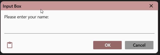
Using a text input box
string result = InputBox.Show("Please enter your name:", color: Color.FromRgb(200, 150, 150));
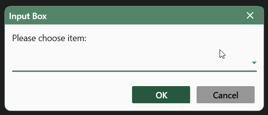
Using combobox input box
string result = InputBox.Show("Please choose item:", new string[] { "Item1", "Item2", "Item3" });
❇️ Toolkits used
This library is built on top of the following toolkits:
- Material Design In XAML Toolkit - Comprehensive and easy to use Material Design theme and control library for the Windows desktop.
- Material Design Colors - ResourceDictionary instances containing standard Google Material Design swatches, for inclusion in a XAML application.
❇️ Contributing to this project
You could always contact me through Email for any feature or issue. ⭐
You need Visual Studio 2015 Community/Enterprise Edition (upwards) to build and test the solution.
❇️ Licence
The MIT License (MIT)
Copyright (c) 2023, Coltherion
Permission is hereby granted, free of charge, to any person obtaining a copy of this software and associated documentation files (the "Software"), to deal in the Software without restriction, including without limitation the rights to use, copy, modify, merge, publish, distribute, sublicense, and/or sell copies of the Software, and to permit persons to whom the Software is furnished to do so, subject to the following conditions:
The above copyright notice and this permission notice shall be included in all copies or substantial portions of the Software.
THE SOFTWARE IS PROVIDED "AS IS", WITHOUT WARRANTY OF ANY KIND, EXPRESS OR IMPLIED, INCLUDING BUT NOT LIMITED TO THE WARRANTIES OF MERCHANTABILITY, FITNESS FOR A PARTICULAR PURPOSE AND NONINFRINGEMENT. IN NO EVENT SHALL THE AUTHORS OR COPYRIGHT HOLDERS BE LIABLE FOR ANY CLAIM, DAMAGES OR OTHER LIABILITY, WHETHER IN AN ACTION OF CONTRACT, TORT OR OTHERWISE, ARISING FROM, OUT OF OR IN CONNECTION WITH THE SOFTWARE OR THE USE OR OTHER DEALINGS IN THE SOFTWARE.
| Product | Versions Compatible and additional computed target framework versions. |
|---|---|
| .NET Framework | net472 is compatible. net48 is compatible. net481 was computed. |
-
.NETFramework 4.7.2
- MaterialDesignColors (>= 2.1.2)
- MaterialDesignThemes (>= 4.8.0)
- Microsoft.Xaml.Behaviors.Wpf (>= 1.1.77)
-
.NETFramework 4.8
- MaterialDesignColors (>= 2.1.2)
- MaterialDesignThemes (>= 4.8.0)
- Microsoft.Xaml.Behaviors.Wpf (>= 1.1.77)
NuGet packages
This package is not used by any NuGet packages.
GitHub repositories
This package is not used by any popular GitHub repositories.