ImagePicker 1.1.3
dotnet add package ImagePicker --version 1.1.3
NuGet\Install-Package ImagePicker -Version 1.1.3
<PackageReference Include="ImagePicker" Version="1.1.3" />
<PackageVersion Include="ImagePicker" Version="1.1.3" />
<PackageReference Include="ImagePicker" />
paket add ImagePicker --version 1.1.3
#r "nuget: ImagePicker, 1.1.3"
#addin nuget:?package=ImagePicker&version=1.1.3
#tool nuget:?package=ImagePicker&version=1.1.3
An easy to use drop-in framework providing user interface for taking pictures and videos and pick assets from Photo Library. User interface is designed to support inputView "keyboard-like" presentation for conversation user interfaces. Project is written in C#.
This library has been rewritten from Swift 4. Original library you can find by the following link
Features:
- presentation designed for chat apps as well as regular view controllers
- portrait and landscape modes (support for iPhone X)
- capturing assets (photos, live photos, videos)
- saving captured assets to Photo Library
- flipping camera to front/rear
- turning on/off live photos
- highly customisable layout and UI
Requirements
- iOS 10.1+
- Xamarin.iOS v12.0.0.15+
- Visual Studio Community 2017 v7.6.8 (build 38)+
- XCode 10.0+
Installation
NuGet:
Install-Package ImagePicker
Overview
A central object ImagePickerController manages user interactions and delivers the results of those interactions to a delegate object. The role and appearance of an image picker controller depend on the configuration you set up before presenting it.
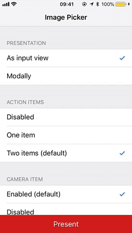
Image Picker consists of 3 main functional parts:
- section of action items - supports up to 2 action buttons, this section is optional and by default contains action item for camera and photos.
- section of camera item - shows camera's video output and provides UI for user to take photos, videos, etc. This section is optinal and by default it's turned on.
- section of asset items - shows thumbnails of assets found in Photo Library allowing user to select them. Section is mandatory and and can not be turned off.
To use an image picker controller, you must provide a delegate that conforms to ImagePickerControllerDelegate class. Use delegate to get informed when user takes a picture or selects an asset from library and configure custom action and asset collection view cells.
To use an image picker controller, perform these steps:
- register permissions in your
info.plistfile (see Permissions section for more info.) - create new instance of ImagePickerController
- optionally configure appearance, layout, custom cells and capture mode
- present image picker's view controller
Permissions
iOS requires you to register the following permission keys in info.plist:
NSPhotoLibraryUsageDescription- for displaying photos and videos from device's Photo LibraryNSCameraUsageDescription- for taking pictures and capturing videosNSMicrophoneUsageDescription- for recording videos or live photos with an audio track
App asks for permissions automatically only when it's needed.
Configuration
Various kind of configuration is supported. All configuration should be done before the view controller's view is first accessed.
- to configure what kind of media should be captured use
CaptureSettings - to configure general visual appearance use
Appearanceclass - to configure layout of action, camera and asset items use
LayoutConfigurationclass. - to use your custom views for action, camera and asset items use
CellRegistratorclass - don't forget to set your
delegateanddataSourceif needed - to define a source of photos that should be available to pick up use view controller's
assetsFetchResultBlockblock
Important
User should handle close state and invoke ImagePicker.Release() when you want to close ImagePicker.
Capture settings
Currently Image Picker supports capturing photos, live photos and videos.
To configure Image Picker to support desired media type use CaptureSettings struct. Use property cameraMode to specify what kind of output you are interested in. If you don't intend to support live photos at all, please use value photo, otherwise photoAndLivePhoto. If you wish to capture photos and videos use photoAndVideo. Capturing videos and live photos at the same time is not supported and you nor can't switch between presets after it's been configrued.
By default, all captured photos are not saved to Photo Library but rather provided to you by the delegate right away. However if you wish to save photos to photo library set SavesCapturedPhotosToPhotoLibrary to true. Live photos and videos are saved to Photo Library automatically.
An example of configuration for taking photos and live photos and saving them to photo library:
var imagePicker = new ImagePickerController();
imagePicker.CaptureSettings.CameraMode = CameraMode.PhotoAndLivePhoto;
imagePicker.CaptureSettings.SavesCapturedPhotosToPhotoLibrary = true;
Please refer to CaptureSettings public class for more information.
Providing your own photos fetch result
By default Image Picker fetches from Photo Library 1000 photos and videos from smart album smartAlbumUserLibrary that should represent Camera Roll album. If you wish to provide your own fetch result please implement image picker controller's AssetsFetchResultBlock block.
For example to fetch only live photos you can use following code snippet:
var imagePicker = new ImagePickerController();
imagePicker.AssetsFetchResultBlock = () =>
{
    var livePhotosCollection = PHAssetCollection.FetchAssetCollections(PHAssetCollectionType.SmartAlbum,
        PHAssetCollectionSubtype.SmartAlbumLivePhotos, null).firstObject;
    if (livePhotosCollection == null)
    {
        //you can return nil if you did not find desired fetch result, default fetch result will be used.
        return null;
    }

    return PHAsset.FetchAssets((PHAssetCollection) livePhotosCollection, null);
};
For more information how to configure fetch results please refer to Photos framework documentation.
Styling using Appearance
Image picker view hierarchy contains of UICollectionView to show action, camera and asset items and an overlay view to show permissions status. When custom cells are provided via CellRegistrator it is your responsibility to do the styling as well styling custom overlay view for permissions status. However, few style attributes are supported such as background color. Please use custom appearance mechanism to achieve desired styling.
- to style a particular instance of image picker use instances appearance proxy object:
var vc = new ImagePickerController();
vc.Appearance.BackgroundColor = UIColor.Black;
For default styling attributes and more info please refer to public interface of Appearance class.
Please note that UIKit's appearance proxy is not currently supported.
Defining layout using LayoutConfiguration
Image picker supports various kind of layouts and both vertical and horizontal scroll direction. Using LayoutConfiguration you can set layout that you need specifically to your app.
- Action Items are always shown as first section and can contain up to 2 buttons. By default this section shows 2 items. Next example will show how to turn off second action item:
var imagePicker = new ImagePickerController();
imagePicker.LayoutConfiguration.ShowsSecondActionItem = false;
- Camera Item is always shown in a section after action items section. So if action item if off this section is shown as first. Camera item section is by default on, so if you wish to turn it off use following code:
var imagePicker = new ImagePickerController();
imagePicker.LayoutConfiguration.ShowsCameraItem = false;
Please note that if you turn off camera section, Image Picker will not ask user for camera permissions.
- Asset Items are always shown regardless if there are any photos in the app. You can control how many asset items are in a col or a row (based on scroll direction). By default, there are 2 asset in a col or a row. To change this to 1 see next snippet:
var imagePicker = new ImagePickerController();
imagePicker.LayoutConfiguration.NumberOfAssetItemsInRow = 1;
Please note that provided value must be greater than 0 otherwise an exception will be thrown.
- Other layout properties
- interitemSpacing - spacing between items when laying out the grid
- actionSectionSpacing - spacing between action items section and camera item section
- cameraSectionSpacing - spacing between camera section and asset items section
Providing custom views
All views used by Image Picker can be provided by you to achieve highly customisable UI that fits your app the best. As mentioned earlier, whole UI consists of a collection view and an overlay view.
- collection view uses cells to display action, camera and asset items. By default Image Picker provides cells for you with standard features and UI. However, if you wish to use your own cells incorporating your own UI and features use
CellRegistrator. It contains API to register both nibs and classes for each section type. For example to register custom cells for action items section use following code:
var imagePicker = new ImagePickerController();
imagePicker.CellRegistrator.RegisterNibForActionItems(UINib.FromName("IconWithTextCell", null));
Same principle is applied to registering custom camera and asset items. You can also set specific cells for each asset media types such photos and videos. For example to use specific cell for video assets use:
var imagePicker = new ImagePickerController();
imagePickerCellRegistrator.Register(UINib.FromName("CustomVideoCell", null), PHAssetMediaType.Video);
imagePicker.cellRegistrator.Register(UINib.FromName("CustomImageCell", null), PHAssetMediaType.Image);
Note: Please make sure that if you use custom cells you register cells for all media types (audio, video) otherwise Image Picker will throw an exception. Please don't forget that camera item cells must subclass CameraCollectionViewCell and asset items cells must conform to
ImagePickerAssetCellprotocol. You can also fine-tune your asset cells to a specific asset types such us live photos, panorama photos, etc. using the delegate. Please see our ExampleApp for implementation details.
- overlay view is shown over collection view in situations when app does not have access permissions to Photos Library. To support overlay view please implement a datasource conforming to
ImagePickerControllerDatasourceclass. Possible implementation could look like this:
ImagePickerControllerDataSource : ImagePickerControllerDataSource
{
    public override UIView ImagePicker(PHAuthorizationStatus status)
    {
        var infoLabel = new UILabel(CGRect.Empty)
        {
            BackgroundColor = UIColor.Green, TextAlignment = UITextAlignment.Center, Lines = 0
        };

        switch (status)
        {
            case PHAuthorizationStatus.Restricted:
                infoLabel.Text = "Access is restricted\n\nPlease open Settings app and update privacy settings.";
                break;
            case PHAuthorizationStatus.Denied:
                infoLabel.Text = "Access is denied by user\n\nPlease open Settings app and update privacy settings.";
                break;
        }

        return infoLabel;
    }
}
Implementing custom action cell
If you wish to use your own action item cells, please register your cell classes or nibs at CellRegistrator. After that implement corresponding ImagePickerControllerDelegate method to configure cell before it's displayed.
- use layout configuration to set your number of action items desired
var imagePicker = new ImagePickerController();
imagePicker.LayoutConfiguration.ShowsFirstActionItem = true;
imagePicker.LayoutConfiguration.ShowsSecondActionItem = true;
- register your action cells on cell registrator, for example
imagePicker.RegisterCellClassForActionItems(typeof(IconWithTextCell))
- configure cell by implementing delegate method, for example
void WillDisplayActionItem(ImagePickerController controller, UICollectionViewCell cell, int index)
{
    var textCell = cell as IconWithTextCell;
    textCell.TitleLabel = "Camera";
}
- handle actions by implementing delegate method
void DidSelectActionItemAt(int index)
{
    Console.Writeline("did select action \(index)")
}
Implementing custom camera cell
Image picker provides a default camera cell that adapts to taking pictures, live photos or videos based on captureSettings.
If you wish to implement fancier features you must provide your own subclass of CameraCollectionViewCell or nib file with custom cell class subclassing it and implement dedicated methods.
Note: Please note, that custom nib's cell class must inherit from
CameraCollectionViewCelland must not specify any reuse identifer. Image Picker is handling reuse identifiers internally.
Supported features of whoose UI can be fully customized:
- taking photos, live photos, recording videos, flipping camera
- providing custom buttons (camera flipping, taking photos, recording videos)
- updating Live Photo status
- updating recording status
- showing current access permissions to camera
To see an example of custom implementation that supports all mentioned features please see class LivePhotoCameraCell and VideoCameraCell of Image Picker source code..
Implementing custom assets cell
Image picker provides a default assets cell that shows an image thumbnail, selected state, if asset is video it shows an icon and duration and if it's an live photo it shows an icon. If you wish to provide custom asset cell, that could show for example asset's media subtype (live photo, panorama, HDR, screenshot, streamed video, etc.) simply register your own asset cells on CellRegistrator that conforms to ImagePickerAssetCell and in implement image picker delegate's func imagePicker(controller: ImagePickerController, willDisplayAssetItem cell: ImagePickerAssetCell, asset: PHAsset) method. Possible example implementation could be:
- register cell classes for each asset media type, for example
var imagePicker = new ImagePickerController();
collectionView.RegisterClassForCell(typeof(CustomImageCell), PHAssetMediaType.Image);
collectionView.RegisterClassForCell(typeof(CustomVideoCell), PHAssetMediaType.Video);
Please note, that
CellRegistratorprovides a method to register 1 cell or nib for any asset media type.
- implement delegate method to configure your asset cells, for example
public override void WillDisplayAssetItem(ImagePickerController controller, ImagePickerAssetCell cell, PHAsset asset)
{
    switch (cell)
    {
        case var _ when cell is CustomVideoCell videoCell:
            videoCell.Label.Text = GetDurationFormatter().StringFromTimeInterval(asset.Duration);
            break;
        case var _ when cell is CustomImageCell imageCell:
            switch (asset.MediaSubtypes)
            {
                case PHAssetMediaSubtype.PhotoLive:
                    imageCell.SubtypeImage.Image = UIImage.FromBundle("icon-live");
                    break;
                case PHAssetMediaSubtype.PhotoPanorama:
                    imageCell.SubtypeImage.Image = UIImage.FromBundle("icon-pano");
                    break;
                default:
                {
                    if (UIDevice.CurrentDevice.CheckSystemVersion(10, 2) &&
                        asset.MediaSubtypes == PHAssetMediaSubtype.PhotoDepthEffect)
                    {
                        imageCell.SubtypeImage.Image = UIImage.FromBundle("icon-depth");
                    }

                    break;
                }
            }

            break;
    }
}
To see an example of custom implementation that supports all mentioned features please see class VideoAssetCell and AssetCell of Image Picker source code.
Presentation
If you wish to present Image Picker in default set up, you don't need to do any special configuration, simple create new instance and present a view controller:
var imagePicker = new ImagePickerController();
PresentViewController(imagePicker, true, null);
However, most of the time you will want to do custom configuration so please do all the configuration before the view controller's view is loaded (viewDidLoad() method is called).
var imagePicker = new ImagePickerController();
imagePicker.CellRegistrator = ...
imagePicker.LayoutConfiguration = ...
imagePicker.CaptureSettings = ...
imagePicker.Appearance = ...
imagePicker.DataSource = ...
imagePicker.Delegate = ...
PresentViewController(imagePicker, true, null);
If you wish to present Image Picker as "keyboard" in your chat app, you have to set view controller's view as inputView of your first responder and:
- set view's autoresizing mask to
.flexibleHeightif view's height should be default keyboard height - set view's
frame.size.heightto get fixed height To see an example how to set up Image Picker as an input view of a view controller refer to our Example App.
Optionaly, before presenting image picker, you can check if user has granted access permissions to Photos Library using PHPhotoLibrary API and ask for permissions. If you don't do it, image picker will take care of this automatically for you after it's presented.
Accessing, selecting and deselecting asset items
All user actions such as selecting/deselecting of assets, taking new photos or livephotos or capturing vides are advertised using ImagePickerControllerDelegate delegate methods. For list and more detail explanation please see public header.
Sometimes you will need to manage selected assets programatically. Image Picker provides several convinience methods to work with asset items.
SelectedAssetsproperty returns an array of currently selectedPHAssetitems- to access asset items at certain indexes, use
Assets(at)andAsset(at) - to programatically select an asset item use
SelectAsset(scrollPosition:) - to programatically deselect an asset item use
DeselectAsset(at,animated,) - to programatically deselect all selected items use
DeselectAllAssets(_:)
| Product | Versions Compatible and additional computed target framework versions. |
|---|---|
| .NET | net6.0-ios10.2 is compatible. net7.0-ios was computed. net8.0-ios was computed. net9.0-ios was computed. net10.0-ios was computed. |
-
net6.0-ios10.2
NuGet packages
This package is not used by any NuGet packages.
GitHub repositories
This package is not used by any popular GitHub repositories.
Migration to .NET6