Blazor_PersianDatePickerZO 2.0.1
dotnet add package Blazor_PersianDatePickerZO --version 2.0.1
NuGet\Install-Package Blazor_PersianDatePickerZO -Version 2.0.1
<PackageReference Include="Blazor_PersianDatePickerZO" Version="2.0.1" />
<PackageVersion Include="Blazor_PersianDatePickerZO" Version="2.0.1" />
<PackageReference Include="Blazor_PersianDatePickerZO" />
paket add Blazor_PersianDatePickerZO --version 2.0.1
#r "nuget: Blazor_PersianDatePickerZO, 2.0.1"
#:package Blazor_PersianDatePickerZO@2.0.1
#addin nuget:?package=Blazor_PersianDatePickerZO&version=2.0.1
#tool nuget:?package=Blazor_PersianDatePickerZO&version=2.0.1
ZO Blazor Persian Date Picker
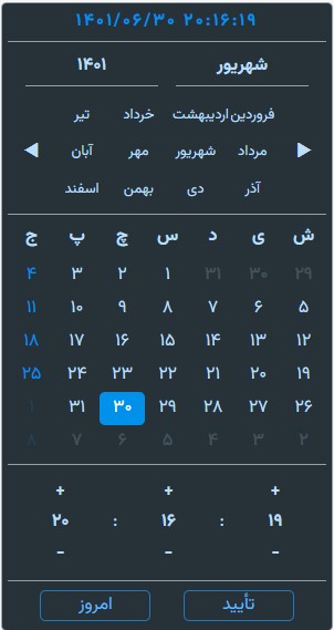
This Date picker is a blazor component written using C# only and no javascript. This date picker only works with jalali calender. We created this component for the personal use but we decided to publish it on github for other people that feel the need for a persian date picker component like us. Note that we didn't use culture in this calender since it was going to be used only for the jalali/persian calender.
 |
|  |
|
Prerequisites
Quick Installation Guide
Install-Package Blazor_PersianDatePickerZO
Add the following link to index.html (client-side) or _Host.cshtml (server-side) in the head
<link href="_content/Blazor_PersianDatePickerZO/AppDatePickerZeroOne.css" rel="stylesheet" />
<script src="_content/Blazor_PersianDatePickerZO/AppDatePickerZeroOne.js"></script>
Add the following imports to _Imports.razor
@using Blazor_PersianDatePickerZO.Component
@using Blazor_PersianDatePickerZO.Hellper
Usage
Date Picker Usage
< DatePickerZO PupupDatePickerZO="true OR false" @bind-SelectDate="@value">

@code {
  public DateTime value { get; set; }
}
Range Date Picker Usage
<DatePickerZORange SelectDateFirst="@dateFirst" SelectDateLast="@dateLast"  />

@code {
  public DateTime dateFirst { get; set; }
  public DateTime dateLast { get; set; }
}
Theming
use one of the following enum members to change the theme of the date picker
< DatePickerZO ThemePickerZO="ThemeDatePickerZO.darkblue">
enum ThemeDatePickerZO
{
   lightgreen,
   lightred,
   lightblue,
   lightpurple,
   lightorange,
   lightgray,
   darkgreen,
   darkred,
   darkblue,
   darkpurple,
   darkorange,
   darkgray
}
Individual Modules
The main date picker consists of multiple components and the components can be used individualy like the samples below
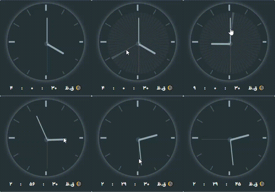
Time Only
There are 2 different time picker components with different looks that can be used in different scenarios
 <TimeZO   @bind-SelectDate="@value"/>
<ClockZO  @bind-SelectDate="@value" />
Day Only
<DayZO @bind-SelectDate="@value" />
year and month
<YearMonthZO @bind-SelectDate="@value" />
chang format
Format="TypeFormat" yyyy/MM/dd Or yy/MM/dd Or MMM Or ddd Or ..
<DatePickerZO Format="ddd D MMM سال yyyy ساعت hh:mm:ss" />
| Product | Versions Compatible and additional computed target framework versions. |
|---|---|
| .NET | net8.0 is compatible. net8.0-android was computed. net8.0-browser was computed. net8.0-ios was computed. net8.0-maccatalyst was computed. net8.0-macos was computed. net8.0-tvos was computed. net8.0-windows was computed. net9.0 was computed. net9.0-android was computed. net9.0-browser was computed. net9.0-ios was computed. net9.0-maccatalyst was computed. net9.0-macos was computed. net9.0-tvos was computed. net9.0-windows was computed. net10.0 was computed. net10.0-android was computed. net10.0-browser was computed. net10.0-ios was computed. net10.0-maccatalyst was computed. net10.0-macos was computed. net10.0-tvos was computed. net10.0-windows was computed. |
-
net8.0
- Microsoft.AspNetCore.Components.Web (>= 8.0.11)
NuGet packages
This package is not used by any NuGet packages.
GitHub repositories
This package is not used by any popular GitHub repositories.