AlohaKit.Animations
1.1.0
dotnet add package AlohaKit.Animations --version 1.1.0
NuGet\Install-Package AlohaKit.Animations -Version 1.1.0
<PackageReference Include="AlohaKit.Animations" Version="1.1.0" />
<PackageVersion Include="AlohaKit.Animations" Version="1.1.0" />
<PackageReference Include="AlohaKit.Animations" />
paket add AlohaKit.Animations --version 1.1.0
#r "nuget: AlohaKit.Animations, 1.1.0"
#:package AlohaKit.Animations@1.1.0
#addin nuget:?package=AlohaKit.Animations&version=1.1.0
#tool nuget:?package=AlohaKit.Animations&version=1.1.0
AlohaKit Animations - Animation Library for .NET MAUI
<div align="center"> <a href="https://www.nuget.org/packages/AlohaKit.Animations"><img src="https://img.shields.io/nuget/v/AlohaKit.Animations?color=blue&style=flat-square&logo=nuget"></a> <a href="https://www.nuget.org/packages/AlohaKit.Animations"><img src="https://img.shields.io/nuget/dt/AlohaKit.Animations.svg?style=flat-square"></a> <a href="./LICENSE"><img src="https://img.shields.io/github/license/jsuarezruiz/AlohaKit.Animations?style=flat-square"></a> </div>
AlohaKit.Animations is a library designed for .NET MAUI that aims to facilitate the use of animations to developers. Very simple use from C# and XAML code.
NOTE: This library is a port of Xamanimation to .NET MAUI.
We can define animations in XAML to a visual element when loading through a Behavior, use a trigger in XAML to execute the animation or from C# code.
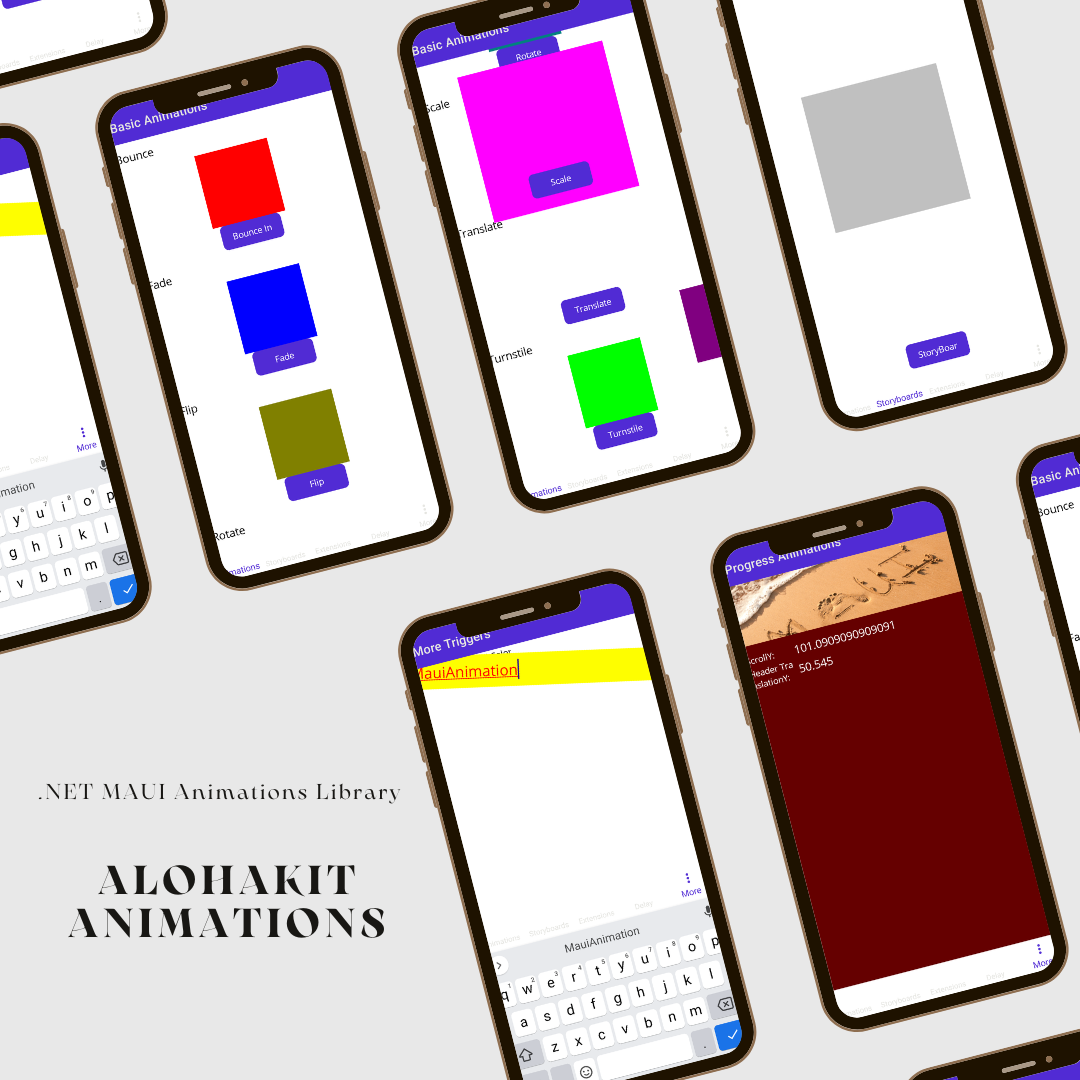
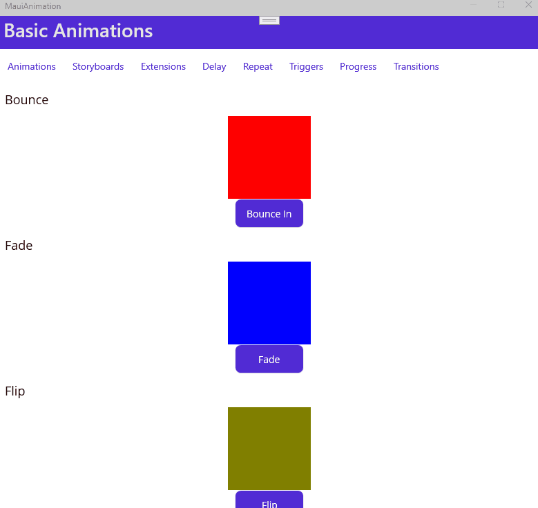
Available animations:
- Color
- FadeTo
- Flip
- Heart
- Jump
- Rotate
- Scale
- Shake
- Translate
- Turnstile
Usage
Step 1: Include the AlohaKit.Animations package reference in your project.
Step 2: Enjoy coding!.
Animations directly from XAML
One of the main advantages of the library is the possibility of using animations from XAML. We must use the following namespace:
xmlns:AlohaKit.Animations="clr-namespace:AlohaKit.Animations;assembly=AlohaKit.Animations"
Let's animate a BoxView:
<BoxView
    x:Name="FadeBox"
    HeightRequest="120"
    WidthRequest="120"
    Color="Blue" />
we can define animations directly in XAML (as Application or Page Resources):
<alohakit:FadeToAnimation
    x:Key="FadeToAnimation"
    Target="{x:Reference FadeBox}"
    Duration="2000"
    Opacity="0"/>
Using the namespace of AlohaKit.Animations, we have access to the whole set of animations of the library. In all of them there are a number of common parameters such as:
- Target: Indicate the visual element to which we will apply the animation.
- Duration: Duration of the animation in milliseconds.
Depending on the animation type used, we will have more parameters to customize the specific animation. For example, in the case of Fade Animation we will have an Opacity property to set how we modify the opacity.
To launch the animation we have two options:
- Trigger: Called BeginAnimation that allows us to launch an animation when a condition occurs.
- Behavior: We have a Behavior called BeginAnimation that we can associate to a visual element so that indicating the desired animation, we can launch the same when the element load occurs.
Using the Clicked event of a button we can launch the previous animation using the trigger provided:
<Button
    Text="Fade">
    <Button.Triggers>
        <EventTrigger Event="Clicked">
            <alohakit:BeginAnimation
                Animation="{StaticResource FadeToAnimation}" />
        </EventTrigger>
    </Button.Triggers>
</Button>
We also have the concept of Storyboard as a set of animations that we can execute over time:
<alohakit:StoryBoard
    x:Key="StoryBoard"
    Target="{x:Reference StoryBoardBox}">
    <alohakit:ScaleToAnimation  Scale="2"/>
    <alohakit:ShakeAnimation />
</alohakit:StoryBoard>
Using C#
In the same way that we can use the animations of the library from XAML, we can do it from C# code. We have an extension method called Animate that expects an instance of any of the available animations.
If we want to animate a BoxView called AnimationBox:
<BoxView
    x:Name="AnimationBox"
    HeightRequest="120"
    WidthRequest="120"
    Color="Blue" />
Access the element, use the Animate method with the desired animation:
AnimationBox.Animate(new HeartAnimation());
Take control of the animation
You can control the duration of the animation using the Duration property. In addition to the type of Easing to use. Now, new properties have also been added such as:
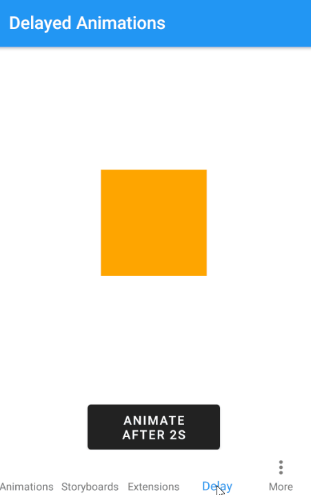
Delay Add a delay before play the animation.
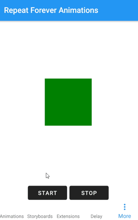
Repeat Forever Now you can create infinite animations if you need it.
Triggers!
Triggers allow you to start animations declaratively in XAML based on events or property changes.
<Entry
    FontSize="16"
    BackgroundColor="LightGray">
    <Entry.Triggers>
        <Trigger TargetType="Entry" Property="IsFocused" Value="True">
            <Trigger.EnterActions>
                <alohakit:AnimateDouble TargetProperty="Entry.FontSize" To="24"/>
                <alohakit:AnimateColor TargetProperty="Entry.TextColor" To="Red"/>
                <alohakit:AnimateColor TargetProperty="VisualElement.BackgroundColor" To="Yellow" Delay="1000"/>
                <alohakit:AnimateDouble TargetProperty="VisualElement.Rotation" To="12" Duration="100"/>
            </Trigger.EnterActions>
            <Trigger.ExitActions>
                <alohakit:AnimateDouble TargetProperty="{x:Static Entry.FontSizeProperty}" To="16"/>
                <alohakit:AnimateColor TargetProperty="{x:Static Entry.TextColorProperty}" To="Black"/>
                <alohakit:AnimateColor TargetProperty="{x:Static VisualElement.BackgroundColorProperty}" To="LightGray"/>
                <alohakit:AnimateDouble TargetProperty="{x:Static VisualElement.RotationProperty}" To="0"/>
            </Trigger.ExitActions>
        </Trigger>
    </Entry.Triggers>
</Entry>
You can animate any property of type Int, Double, Color, Thickness or CornerRadius. Available options:
- AnimateInt
- AnimateColor
- AnimateCornerRadius
- AnimateDouble
- AnimateThickness
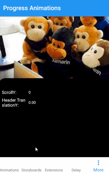
Progress Animations
Sometimes you need to animate something based on a value that changes over time, for example as a a the result of a user interaction.
A common scenario is using a scroll. A parallax effect, etc.
<BoxView
    BackgroundColor="Red"
    CornerRadius="24, 24, 0, 0">
    <VisualElement.Behaviors>
        <alohakit:AnimateProgressColor
            TargetProperty="VisualElement.BackgroundColor"
            Progress="{Binding ScrollY, Source={x:Reference ScrollBehavior}}"
            Minimum="0"
            Maximum="200"
            From="Black"
            To="Red"/>
        <alohakit:AnimateProgressCornerRadius
            TargetProperty="BoxView.CornerRadius"
            Progress="{Binding ScrollY, Source={x:Reference ScrollBehavior}}"
            Minimum="0"
            Maximum="200"
            From="24, 24, 0, 0"
            To="0,0,0,0"/>
    </VisualElement.Behaviors>
</BoxView>
Available options:
- AnimateProgressInt
- AnimateProgressColor
- AnimateProgressCornerRadius
- AnimateProgressDouble
- AnimateProgressThickness
Feedback
Please use GitHub issues for questions or comments.
Copyright and license
Code released under the MIT license.
| Product | Versions Compatible and additional computed target framework versions. |
|---|---|
| .NET | net8.0 is compatible. net8.0-android was computed. net8.0-android34.0 is compatible. net8.0-browser was computed. net8.0-ios was computed. net8.0-ios17.2 is compatible. net8.0-maccatalyst was computed. net8.0-maccatalyst17.2 is compatible. net8.0-macos was computed. net8.0-tvos was computed. net8.0-windows was computed. net8.0-windows10.0.19041 is compatible. net9.0 was computed. net9.0-android was computed. net9.0-browser was computed. net9.0-ios was computed. net9.0-maccatalyst was computed. net9.0-macos was computed. net9.0-tvos was computed. net9.0-windows was computed. net10.0 was computed. net10.0-android was computed. net10.0-browser was computed. net10.0-ios was computed. net10.0-maccatalyst was computed. net10.0-macos was computed. net10.0-tvos was computed. net10.0-windows was computed. |
-
net8.0
- No dependencies.
-
net8.0-android34.0
- No dependencies.
-
net8.0-ios17.2
- No dependencies.
-
net8.0-maccatalyst17.2
- No dependencies.
-
net8.0-windows10.0.19041
- No dependencies.
NuGet packages
This package is not used by any NuGet packages.
GitHub repositories (2)
Showing the top 2 popular GitHub repositories that depend on AlohaKit.Animations:
| Repository | Stars |
|---|---|
|
dotnet/maui-samples
Samples for .NET Multi-Platform App UI (.NET MAUI)
|
|
|
dorisoy/Dorisoy.SIOT
一款利用.NET 8.0和MAUI框架打造的跨平台牙科治疗机物联网移动端应用,实现了对水温Speedometer监测、高速手机转速RadialGauge显示、电动马达功率检测以及光纤灯光亮度调节等功能的数据采集与仪表盘实时展示,同时支持数据可视化检测和远程操控管理。
|